Continuing on from yesterday’s post about shooting stark, minimalistic images in a boatyard, here are a few more examples.
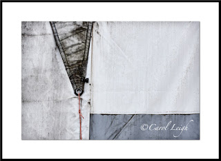
Canvas sails on a wall
My favorite image from the day is this first one, an abstract of a canvas sail-covered wall. It began as the full-frame second shot, which I also like, but I cropped it into a square. Why? Because all the “good stuff” begins just to the left of the darker triangle. The triangle leads your eye down into the frame to the red cord. Your eye then moves along the bluish horizontal bit and then over to the right.
Movement. The square format emphasizes both the shapes and the movement. It keeps your eyes on what I consider the heart of the design.
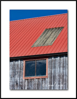
Building detail
More stripes. The first image, with the galvanized metal on the red roof, was taken later in the day than the second one, and the colors weren’t as saturated as they were in the second image, taken earlier in the morning in overcast light. So in Photoshop I pumped up the red roof and the trim in the first picture, leaving the wood and the sky as they were.
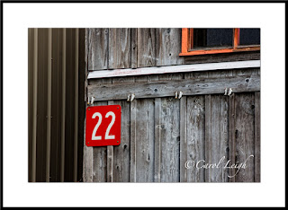
In the second shot, I frankly was going for the #22 and the vertical stripes. My dilemma was do I include part of the red-framed window or do I solely concentrate on the number and the vertical elements? Obviously I decided to include part of the window, but why?
I kept it because it creates visual movement in the frame. Your eye goes first to the #22, quickly notices the vertical lines to the left, but then immediately comes back to the number, and then follows the bold diagonal-ish line across the frame to the window, where the reddish-orange trim echoes the red surrounding the number. So your eye goes back to the number.
I like the repeating patterns of the vertical lines. I like how the number and the window stand out. The diagonal line moves your eye left-right and keeps the vertical lines from being boring. Pattern. Contrast. Movement. Works for me.
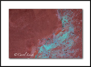
Texture
The cinnamon color looked great with the turquoise patina and immediately caught my eye. It’s not a standalone shot, but something I regularly find and photograph because I use things like this in my photomontages, combining the texture with something else.
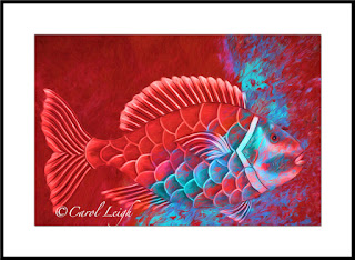
Red fish
I didn’t find the fish at the boatyard (it was part of a sign I photographed in South Carolina). But just for grins, I thought I’d combine the texture shot with the fish photo and then play around using Topaz Impression. It’s unlike anything I normally do, rather gimmicky, but there’s something about it I like. Cool colors. Cool fish. Fun to make. Just thought maybe you’d be interested in seeing one use of the simple texture shot I got at the boatyard.
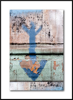
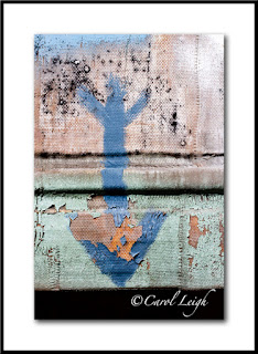
Blue arrow
In the junkier part of the boatyard I found a piece of painted canvas, weathered by rain and sun so that the paint was peeling away here and there and it was just funky. Why photograph this? Because I “collect” arrows. As a standalone shot it doesn’t quite work, but I tend to shoot arrows whenever I find good ones, and this now becomes part of the mix.
The first arrow photo isn’t the original. The second one, with the black empty space at the bottom, is how the arrow actually looked. The canvas ended at the arrow’s point, nothing behind it. I purposely left the black space, knowing I could do something with it later, and that’s what you see in the first shot. I just added more canvas, more paint, more grunge down at the bottom and the picture seems more complete to me now.
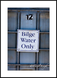
Bilge water
Finally, I took this picture for two reasons. It struck me as mildly humorous. I mean, when’s the last time you saw a container of bilge water? And secondly, I collect photos of signs. I don’t know when (if ever) I will use this picture, but here it is and it goes into the mix.
Why didn’t I move in close and shoot just the sign? Why include the container and the #12? Because just the sign would have been boring. Keeping part of the container in the frame gives the sign a bit of context; and the #12 indicates that there’s a lot more bilge water available if one should need it. At least 11 more containers!
By the way, my stock agency, Alamy, just yesterday sold a photo of a “No Parking” sign I took while on vacation in Breckenridge, Colorado. And it’s not the first time that sign has sold. See? You never know about signs.
So that was my day at the boatyard. Two blog posts showing you what I gravitated to, why, and a bit of how. This is my kind of photography. I leave the big pictures, the grandiose landscapes, the breathtaking scenery to other photographers. My talent and joy comes from being able to zoom in on little interesting bits, things you would find in a boatyard, around military bunkers, antique car shows, on the sides of buildings, at airplane museums, and in back alleys.
Simple, minimalistic shots that feature line, design, and movement. Hope you found it interesting and, perhaps, even inspirational.
©Carol Leigh
All text, photographs, and other media are ©Copyright Carol Leigh (or others when indicated) and are not in the public domain and may not be used on websites, blogs, or in other media without advance permission from Carol Leigh. Thank you!

