Boat bits . . . Found at a boatyard in Port Townsend, Washington. Don't know why I find letters, color, and general wear and tear so appealing. But I do!
All text, photographs, and other media are ©Copyright Carol Leigh (or
others when indicated) and are not in the public domain and may not be
used on websites, blogs, or in other media without advance permission
from Carol Leigh. Thank you for your understanding and kindness.
Showing posts with label boatyard art. Show all posts
Showing posts with label boatyard art. Show all posts
Monday, March 11, 2019
Wednesday, January 30, 2019
Yesterday's trip to Port Townsend


A few pictures from yesterday's trip over to Port Townsend to photograph whatever happened to catch my eye.
This gull was incredibly happy about taking a ferry ride! Well, who wouldn't be? Who doesn't love a harbor cruise?
A bright blue boat was quite dark in the shade, but the sun hitting the brass propeller was perfectly placed to make it show up beautifully. Two minutes later and part of the propeller was in shadow.
The next shot shows the sunny side of the boat, zeroing in on the peeling paint.
And then a brief respite at Nifty Fifties Diner on the main street. Alas, the juke box on the table wasn't working...
A good day, walked a lot, saw a lot, and then back home to collapse. Wonder if this gull goes cruising every day?!
All text, photographs, and other media are ©Copyright Carol Leigh (or others when indicated) and are not in the public domain and may not be used on websites, blogs, or in other media without advance permission from Carol Leigh. Thank you for your understanding and kindness.
Saturday, October 15, 2016
Boatyard art

I'm finding lots of cool grunge these days in boatyards, including this section of a wall as well as a cracked glass something or other amid peeling paint.
Weather update: Doesn't look as though the storm lived up to its dire predictions. We've had steady, gentle rain, a little bit of wind here and there, but nothing like what we were warned might happen. By Saturday afternoon we'll know for sure.
Always good to be prepared. Even better to have dodged a meteorological bullet.
©Carol Leigh
All text, photographs, and other media are ©Copyright Carol Leigh (or others when indicated) and are not in the public domain and may not be used on websites, blogs, or in other media without advance permission from Carol Leigh.
Sunday, September 25, 2016
It came out of the swamp . . .
More "boatyard art," this time from a vessel that had paint peeling off of it as well as some partially finished sanding. The trick to finding things like this is to look for an "eye." Once you have an eye, you just might find you have a strange creature. All you have to do is look...
©Carol Leigh
All text, photographs, and other media are ©Copyright Carol Leigh (or others when indicated) and are not in the public domain and may not be used on websites, blogs, or in other media without advance permission from Carol Leigh.
©Carol Leigh
All text, photographs, and other media are ©Copyright Carol Leigh (or others when indicated) and are not in the public domain and may not be used on websites, blogs, or in other media without advance permission from Carol Leigh.
Labels:
boatyard art,
Carol Leigh,
humor,
peeling paint,
texture as metaphor
Thursday, April 28, 2016
Boatyard art


Nothing like a boatyard filled with grungy, half-refurbished, long-neglected boats where a simple partial sanding reveals multiple layers of paint, striking colors, and interesting shapes.
The only thing better is if the boatyard sits right next door to an automobile salvage lot.
Down the street from the railroad museum.
Over by the fishnet repair facility.
On an overcast day.
©Carol Leigh
All text, photographs, and other media are ©Copyright Carol Leigh (or others when indicated) and are not in the public domain and may not be used on websites, blogs, or in other media without advance permission from Carol Leigh. Thank you!
Sunday, April 3, 2016
Minimalism in a boatyard (part 2 of 2)
Continuing on from yesterday’s post about shooting stark, minimalistic images in a boatyard, here are a few more examples.
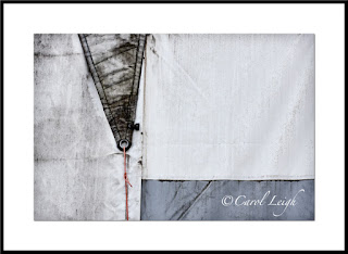
Canvas sails on a wall
My favorite image from the day is this first one, an abstract of a canvas sail-covered wall. It began as the full-frame second shot, which I also like, but I cropped it into a square. Why? Because all the “good stuff” begins just to the left of the darker triangle. The triangle leads your eye down into the frame to the red cord. Your eye then moves along the bluish horizontal bit and then over to the right.
Movement. The square format emphasizes both the shapes and the movement. It keeps your eyes on what I consider the heart of the design.
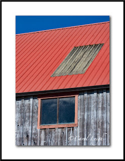
Building detail
More stripes. The first image, with the galvanized metal on the red roof, was taken later in the day than the second one, and the colors weren’t as saturated as they were in the second image, taken earlier in the morning in overcast light. So in Photoshop I pumped up the red roof and the trim in the first picture, leaving the wood and the sky as they were.
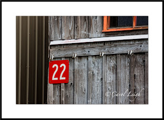
In the second shot, I frankly was going for the #22 and the vertical stripes. My dilemma was do I include part of the red-framed window or do I solely concentrate on the number and the vertical elements? Obviously I decided to include part of the window, but why?
I kept it because it creates visual movement in the frame. Your eye goes first to the #22, quickly notices the vertical lines to the left, but then immediately comes back to the number, and then follows the bold diagonal-ish line across the frame to the window, where the reddish-orange trim echoes the red surrounding the number. So your eye goes back to the number.
I like the repeating patterns of the vertical lines. I like how the number and the window stand out. The diagonal line moves your eye left-right and keeps the vertical lines from being boring. Pattern. Contrast. Movement. Works for me.
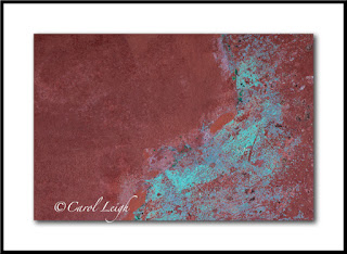
Texture
The cinnamon color looked great with the turquoise patina and immediately caught my eye. It’s not a standalone shot, but something I regularly find and photograph because I use things like this in my photomontages, combining the texture with something else.
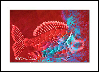
Red fish
I didn’t find the fish at the boatyard (it was part of a sign I photographed in South Carolina). But just for grins, I thought I’d combine the texture shot with the fish photo and then play around using Topaz Impression. It’s unlike anything I normally do, rather gimmicky, but there’s something about it I like. Cool colors. Cool fish. Fun to make. Just thought maybe you’d be interested in seeing one use of the simple texture shot I got at the boatyard.
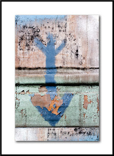
Blue arrow
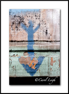
In the junkier part of the boatyard I found a piece of painted canvas, weathered by rain and sun so that the paint was peeling away here and there and it was just funky. Why photograph this? Because I “collect” arrows. As a standalone shot it doesn’t quite work, but I tend to shoot arrows whenever I find good ones, and this now becomes part of the mix.
The first arrow photo isn’t the original. The second one, with the black empty space at the bottom, is how the arrow actually looked. The canvas ended at the arrow’s point, nothing behind it. I purposely left the black space, knowing I could do something with it later, and that’s what you see in the first shot. I just added more canvas, more paint, more grunge down at the bottom and the picture seems more complete to me now.
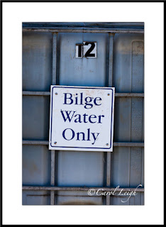
Bilge water
Finally, I took this picture for two reasons. It struck me as mildly humorous. I mean, when’s the last time you saw a container of bilge water? And secondly, I collect photos of signs. I don’t know when (if ever) I will use this picture, but here it is and it goes into the mix.
Why didn’t I move in close and shoot just the sign? Why include the container and the #12? Because just the sign would have been boring. Keeping part of the container in the frame gives the sign a bit of context; and the #12 indicates that there’s a lot more bilge water available if one should need it. At least 11 more containers!
By the way, my stock agency, Alamy, just yesterday sold a photo of a “No Parking” sign I took while on vacation in Breckenridge, Colorado. And it’s not the first time that sign has sold. See? You never know about signs.
So that was my day at the boatyard. Two blog posts showing you what I gravitated to, why, and a bit of how. This is my kind of photography. I leave the big pictures, the grandiose landscapes, the breathtaking scenery to other photographers. My talent and joy comes from being able to zoom in on little interesting bits, things you would find in a boatyard, around military bunkers, antique car shows, on the sides of buildings, at airplane museums, and in back alleys.
Simple, minimalistic shots that feature line, design, and movement. Hope you found it interesting and, perhaps, even inspirational.
©Carol Leigh
All text, photographs, and other media are ©Copyright Carol Leigh (or others when indicated) and are not in the public domain and may not be used on websites, blogs, or in other media without advance permission from Carol Leigh. Thank you!
Saturday, April 2, 2016
Minimalism in a boatyard (part 1 of 2)


On a warm(ish) sunny day in a boatyard, there’s a lot going on. Boats on slings being lifted out of the water, hulls being scraped, trim being repaired, welding, hammering, polishing, wood being planed, sanded, and painted. The noise and activity can be daunting.
Amid the sounds and chaos, it’s my challenge (and my delight) to find the little things, to wander around, watching, looking, trying to find lines and designs apart from and within all the busy-ness.
I’m not a big-picture kind of gal. A boatyard and all it has to offer me and my kind of photography makes me feel alive, giddy even. And so I look for structure, patterns, abstract designs. And I find them where no one else is looking.
My resulting photographs are stark and strong. Some could say empty and boring. And I understand that. But let me show you three photographs I made, and let me tell you why I like them. And isn’t that an important thing about photography, art, etc.? That you make or create a work that fills something inside you, and you are confident about the “why” behind it?
Red-trimmed building
The buildings in this boatyard are an interesting combination of new and made-to-seem-old, and I liked the contrast between the wooden red and blue building in front of a plain, metal building. What they had in common were stripes. Stripes are the unifying factor; old/colorful against new/blah was the jarring factor, the tension. In addition, the strong red diagonal lines of the foreground roof contrast with the repeating vertical lines in both buildings. And then the two rectangular windows, the focal point, give the photograph interest, a place for your eye to land, relieving the endless repetition of the stripes.
Did I think about all those little details before I took the shot? Nah. I looked up, thought to myself, “Cool building. Love the red trim against the blue. And stripes! How can I isolate all that against the background? Most importantly, how can I keep all those straight lines straight?” Knowing what draws me to the scene makes it easy for me to compose the image. Emphasize the good stuff, use the other stuff (if any), to create a bit of tension.
Boat hull
What caught my eye were the drip lines, where time and weather and infrequent maintenance created a repeating pattern of dark and light stripes, where rain and gravity and dirt worked their bit of artistic magic. I positioned myself directly in front of the boat, which sat on stilts slightly above me, so that I could capture both sides of the boat, with the strong vertical line on the right being where everything came together.
What drew my eye were the repeating drip patterns. What created the interest was the strong vertical line against the diagonal lines of the drip patterns. And then the plain part of the hull at the top contrasting with the busy feeling of the rest of the photograph.
Boat fender, or buoy
More stripes. The vertical buoy, the strong repeating pattern of black and white stripes, stands out and contrasts with the plain background and the three horizontal elements at the bottom and top of the shot. Busy against plain. Vertical against horizontal. The buoy caught my eye. My challenge was how to display it. My challenge was also the decision to either include or delete the little bit of blue up at the top. I decided to keep it since it echoed the color blue at the bottom and sort of “contained” the buoy.
What’s my point? I always know exactly what caught my eye, what attracted me to the scene, what I sort of instantly fell in love with. Once I know that, then the rest is easy(ish). How do I make what caught my eye “work?” What do I leave in? What do I leave out? What’s my background doing? Does it compete with my subject or does it enhance it?
The rest is technical. How much do I want in focus? Do I want a perfectly symmetrical shot, or do I want things slightly off-center? Why? Are my “horizon lines” level? Do I want this shot slightly lighter or darker? Is this something I can tweak in Photoshop, or do I create it here? Do I scrape that wad of chewing gum off the hull (ewwww), or do I plan to clone it out in post-processing?
The seeing always comes first. What drew me to the scene? The technical part comes second. Right brain/left brain. Yin/yang.
I think it’s a Gemini thing.
©Carol Leigh
All text, photographs, and other media are ©Copyright Carol Leigh (or others when indicated) and are not in the public domain and may not be used on websites, blogs, or in other media without advance permission from Carol Leigh. Thank you!
Monday, November 2, 2015
Boatyard Art


Chris is having a tough time. He was involved in a bar brawl (no, he didn't start it this time), went to do a karate kick, and ended up tearing a ligament in his foot. Can't walk without a lot of pain.*
So we're spending a fair amount of time here in the house doing not much of anything. Which is fine because it's been a bit rainy.
The result is that I'm scrounging around in old photographs, seeing if there's anything interesting I've shot in the past but haven't processed yet.
These three were taken in a boatyard in Astoria, Oregon (one of my favorite places) in 2012. There were a few old vehicles off to one side and, naturally, I had to take a closer look.
So I leave you to reflect on reflectors while I go check on the patient.
*Nah, not a bar brawl. Did it getting out of his truck. But the bar brawl makes a much better story. Especially if you know Chris!
©Carol Leigh
All text, photographs, and other media are ©Copyright Carol Leigh (or others when indicated) and are not in the public domain and may not be used on websites, blogs, or in other media without advance permission from Carol Leigh. Thank you!
Tuesday, July 16, 2013
Boatage . . .


That's pronounced bo-TAHJ, in case you were wondering . . .
Boat detail is one of my favorite subjects to shoot and, while in Alaska, I sought out boats once again. The two boat hulls were shot in Alaska, the two others (peeling paint and blue reflection of boat-and-rope) are from here on the Oregon coast. I love the abstractness of these photos as well as their square format, which seems to call attention to simple line and design. (Click to enlarge.) ©Carol Leigh
Sunday, June 2, 2013
Birthday celebration . . .


Chris asked if I'd like to go spend time at my favorite boatyard on my birthday and OF COURSE! Hoo ha! So last week, in between raindrops, we did, and here are three images I particularly like, all taken of texture on the sides of boats. No better present than to spend time with him, have lunch alongside a river, and then shoot boat scrapings! Yup,
Friday, February 1, 2013
Latest work: "Boat Textures"
One of my many delights living here on the Oregon coast is the opportunity to photograph fishing boats, specifically, the abstract patterns on their metal hulls. The scrapes, rust, scratches, textures, and colors are (to me) quite exciting. They are works of art in and of themselves. Here you see hints of sea and sky, land and water, stars and fish, all combined into one simple image. I hope you enjoy seeing how common elements can become almost celestial. (As usual, click photo to enlarge.) ©Carol Leigh
Saturday, January 26, 2013
Boatyard art
The weathered rudder on a boat becomes a work of art, a study in composition. I particularly like the colors, the textures, and the various geometric elements. (Click to enlarge.) ©Carol Leigh
Thursday, May 10, 2012
Boatyard Art

Here in Oregon we've got a lot of boats, and they weather quite beautifully, enabling me to take interesting abstract photographs. Here are two I photographed recently. I've also posted six more at my Flickr site here.
This first one gives me a feeling of a person flying kites. But then I also see ships, birds, celestial objects, and perhaps even a cat there in the sky.
And this next one? Looks sort of like an underwater scene to me. Fun stuff!
©Carol Leigh, who flunks every Rorschach test she takes...
Subscribe to:
Posts (Atom)


