Showing posts with label abstract. Show all posts

Thursday, April 11, 2019

It's a good day to . . .


. . . compare and contrast.

It's interesting to go back and suddenly notice similarities and differences in one's photos over the years.

These two have similar compositions and forms.

The color photo of palm trees against a green- and white-painted building were taken in Florida in 2011.

The black and white photo of strips of paper was taken in the city of Orange, California in 2013.

Both are abstracts. Both have no real focal point. Both consist of similar vertical objects. Blah, blah, blah.

I like them both because they're clean, simple, strong, and mysterious.

But I can understand why YOU might not like them at all!

All text, photographs, and other media are ©Copyright Carol Leigh (or others when indicated) and are not in the public domain and may not be used on websites, blogs, or in other media without advance permission from Carol Leigh. Thank you for your understanding and kindness.

Thursday, January 24, 2019

Daily photo: 20190124 Moon Phases (1 and 2)


Because I work as a collage artist as well as a photographer, sometimes the two combine. That’s the case here, where I’ve mixed a collaged book page with a piece of textured paper and created something completely different. Because of all the stir about the recent full moon/lunar eclipse, moons have been on my mind. This is the result -- two different versions, which I began this morning, had breakfast, then finished them up, uploaded them to Fine Art America. My day can now officially begin.

Sometimes it's worth getting up early!

All text, photographs, and other media are ©Copyright Carol Leigh (or others when indicated) and are not in the public domain and may not be used on websites, blogs, or in other media without advance permission from Carol Leigh. Thank you for your understanding and kindness.


Friday, November 30, 2018

Latest work . . .


These pictures have finally been uploaded to Fine Art America -- it took me all month to create them. I'm hoping it was worth the wait!

As I was playing with different colors and shapes, I began thinking of a stage set, looking behind the scenes as well as from the audience’s point of view.

"Rehearsal"
The top picture is titled "Rehearsal." This one implies the “organized confusion” of what goes on both behind the scenes and from an empty theater’s point of view.

No audience, just the actors and crew finding their places, making adjustments, moving sets, fine-tuning the production. And are those guitar strings there at the bottom?

"Opening Night"
"Opening Night" appears in a square version as well as a wider horizontal. And I know this may sound weird, but don’t the round things at the bottom seem like a very attentive audience, waiting for the play to begin? No? Just me, I guess!

All text, photographs, and other media are ©Copyright Carol Leigh (or others when indicated) and are not in the public domain and may not be used on websites, blogs, or in other media without advance permission from Carol Leigh. Thank you for your understanding and kindness.

Thursday, April 12, 2018

Agave teeth . . .

Over in my Facebook "Photomotivation" group, our assignment this month is "Shadowplay." Here's one of the photos I posted of a closeup of an agave frond.

A number of people found it (understandably) confusing, with one person seeing birds flying, not the sharp spines of an agave plant.

Not unlike an artichoke, agave plants consist of tightly wrapped fronds which, as they grow, gradually pull away from the plant and eventually splay out and away from the "core." The right third of the frame is the agave frond as it has just begun lifting away from plant's core immediately below it. The bright sunlight coming from my right creates a dark shadow on the rest of the plant. I purposely made this a high-key image to add to the scene's simplicity and to create a strong abstract.

What pleases me is its simplicity, the fact that the picture is divided into three strong elements, and the impact of negative space. 

Confusing? Confused? Yeah, me, too . . .

P.S. If you'd like to see what's going on over in the Photomotivation group and maybe join us, here's the link: https://www.facebook.com/groups/2141715679386032/  Since the group is a private one, you may not be able to see much. Join the group and all will be revealed. 

All text, photographs, and other media are ©Copyright Carol Leigh (or others when indicated) and are not in the public domain and may not be used on websites, blogs, or in other media without advance permission from Carol Leigh. Thank you for your understanding and kindness.

Thursday, March 1, 2018

Latest work: "Going Wherever It Leads"

Created in the early hours of this morning.

Hand-painted papers come together to create a soothing abstract image.

For me, it conjures up tropical waters, distant islands, traveling without a plan, the spirit of exploration. But that’s just me! Others may see something entirely different.

All text, photographs, and other media are ©Copyright Carol Leigh (or others when indicated) and are not in the public domain and may not be used on websites, blogs, or in other media without advance permission from Carol Leigh. Thank you for your kindness.

Thursday, October 5, 2017

From color to black and white (part 2 of 7)


There's a challenge going around in my corner of Facebook at the moment where someone challenges someone else to create one black and white image a day and to post it on Facebook. The "rules" are "no people and no explanation."

For my second photograph, I selected this picture, also taken in South Carolina. Whereas a number of people really liked my first picture, not many liked this one. And I can understand why.

As a black and white it looks even weirder than it does in color. I like both versions, however, and it doesn't bother me that it was less popular than the first. Also, by looking at it in black and white, I think it might just work in a photomontage of some sort. We shall see.

What is it? I was standing on a grassy bank, looking across a bit of water, to a pier. It was the almost Roman numeral-ish look of the pilings that caught my eye, not the actual pier itself.

©Carol Leigh
All text, photographs, and other media are ©Copyright Carol Leigh (or others when indicated) and are not in the public domain and may not be used on websites, blogs, or in other media without advance permission from Carol Leigh.

Wednesday, September 27, 2017

Latest work: "So Long, Pete Turner"


When I was a little photographer, Pete Turner’s work was so exciting. And the picture below, of the trash can, was what drew me in. So colorful. So clean. So simple. His images were what I wanted to emulate. He passed away last week. But his work, his colors, live on in my head.

I was creating this top picture when I learned of Turner's death. So I saturated the heck out of it! So long, Pete Turner.

(Pete Turner photograph courtesy of Pete Turner Studio.)

©Carol Leigh
All text, photographs, and other media are ©Copyright Carol Leigh (or others when indicated) and are not in the public domain and may not be used on websites, blogs, or in other media without advance permission from Carol Leigh.

Thursday, June 29, 2017

Rudder repair . . .

It was a wonderful day of exploring yesterday. Off to Fort Flagler on Marrowstone Island to check out the gun emplacements. To Mystery Bay, just because it had a cool name and there was a dock and there were boats moored offshore. To test out a new restaurant in Port Townsend (Alchemy). And then to the boat yard to just walk, walk, walk, look, look, look, and shoot, shoot, shoot.

The fort was fine. Not "wow" fine, but worthy of a photo visit. A bald eagle in a tree. A beach full of driftwood. A number of big barnacles to bring home, to tell people that no, these are whale vertebrae!

Mystery Bay is no longer a mystery, and certainly would be worth another go under different weather conditions.

The restaurant was wonderful, with a to-go box of mushroom ravioli to have again at lunch today.

And the boat yard? Well, it may sound strange, but that's my favorite place. Boats in all sorts of repair and disrepair, being built, being sanded, being painted, holes being patched, and this rudder being de-barnacleized.

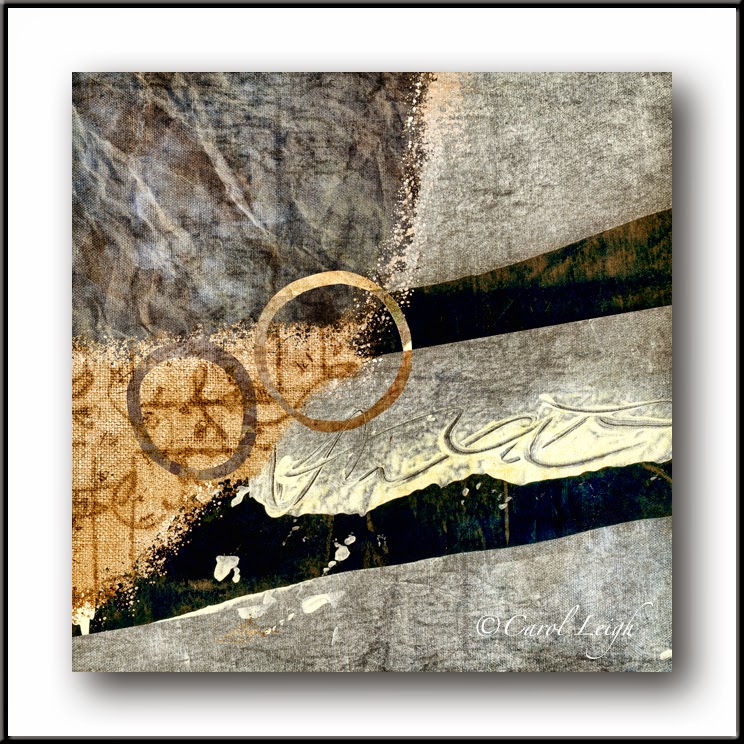
The rudder caught my eye because it was all a lovely blue color except brushed silver where it had been sanded. The blue and silver colors were mesmerizing. In a small photograph, however, I decided that changing it to a black and white image, rotating the picture 90 degrees, put more emphasis on the mysterious patterns the boat worker had unwittingly created.

"The first hour of the morning is the rudder of the day." (A quote from Henry Ward Beecher, a minister who lived in the 1800s.) And my first hour of this day was to work on a photograph of a rudder. A good start, methinks.

©Carol Leigh
All text, photographs, and other media are ©Copyright Carol Leigh (or others when indicated) and are not in the public domain and may not be used on websites, blogs, or in other media without advance permission from Carol Leigh.

Friday, April 21, 2017

Latest work: "Mapping the Mountains"

I have the attention span of a hummingbird. So easily distracted.

I'm creating a variety of stained, painted, bleached, inked, folded, spindled, and mutilated papers for the handmade book I'm working on, but often I'll stare down at this pile o' papers and the way one sits atop another catches my eye. Aha! A collage!

So I begin pushing papers around, adding this, adding that, then bring them into the computer, add even more elements, and the next thing you know, this picture happens.

I've now uploaded it to Fine Art America and call it "Mapping the Mountains." Here's how I describe it:

Warm-colored aged and dyed papers, ink splatters, a page from an antique Japanese ledger, a hand-drawn circle, and more come together in this piece. I detect a sense of mystery, of exploration, perhaps an old map.

Will this ever sell? As usual, I hope so, but I never know. But if it does, then hooray, right? And if it doesn't? Well, then, hooray again, because I've made something original, something no one else has made, and something that pleases me.

And now, back to the handmade book. But wait! The tulips are blooming in the Skagit Valley right now, so it's off-island this morning.

©Carol Leigh
All text, photographs, and other media are ©Copyright Carol Leigh (or others when indicated) and are not in the public domain and may not be used on websites, blogs, or in other media without advance permission from Carol Leigh.


Wednesday, March 8, 2017

Urban simplicity...

Sometimes it pays to watch where you're walking!

©Carol Leigh
All text, photographs, and other media are ©Copyright Carol Leigh (or others when indicated) and are not in the public domain and may not be used on websites, blogs, or in other media without advance permission from Carol Leigh.

Sunday, February 19, 2017

Color or B&W?


As I was playing around with my photographs, I focused on a shot I'd taken of an old airplane at Castle Air Museum in California.

I created a series of color images and then, just to see how they'd look, converted them to black and white.

I wanted to upload them to Fine Art America, but didn't know which to select: the color images or the black and white.

Although I think the color version looks pretty cool, the colors throughout weren't consistent enough to make an effective series.

All the black and white ones (seven of them) "worked together" to make a stronger whole. For me, they have a sort of masculine, contemporary vibe, and I could see them in an upscale apartment or condo that has a relatively monochromatic color scheme.

It's interesting to see the mindset change when we begin marketing our work. I like the color version, but as a series, believe that the black/white/grey combo is more marketable.

©Carol Leigh
All text, photographs, and other media are ©Copyright Carol Leigh (or others when indicated) and are not in the public domain and may not be used on websites, blogs, or in other media without advance permission from Carol Leigh.

Sunday, September 4, 2016

Appealing starkness

A number of years ago I attended a Photoshop conference in Portland. The conference lasted all day and, of course, I remember nothing of what I learned. What I DO remember were the occasional breaks and the lunch break, where I simply wandered around the building, around the block, taking photographs.

I particularly like this one, taken inside the convention center, composed of three basic sections -- the black/grey swoop in the right third, the gentle grey curve in the lower left, and then the repeating, seemingly delicate, light-colored rectangular windows in the upper left. Lines and curves, lights and darks, all working together beautifully.

I'm in Nova Scotia right now and prepped this image in advance to appear while I am gone. 

©Carol Leigh
All text, photographs, and other media are ©Copyright Carol Leigh (or others when indicated) and are not in the public domain and may not be used on websites, blogs, or in other media without advance permission from Carol Leigh.


Friday, September 11, 2015

Following a paper trail . . .


My friend Kathleen Amt has been playing around with paper and with her cellphone, also using this same "Lone Star" effect. She sent me a photo she took of some folded paper and, of course, it was brilliant.

So I looked around. What can I shoot and send to her? I've got a gull feather sitting on a bookshelf and so I held it up in front of the camera and made the first photo you see here. Sent it off to her.

Kathleen sent me another photo of scrap paper. Sigh. She's raised the bar pretty high. And she's made it clear she's working with and photographing paper, not anything like seagull feathers . . . I get the hint.

So I go out to the studio where I'm making envelopes (don't ask) and there are a lot of papers lying around. I arrange some corrugated cardboard bits and created the second photo you see here.

Then I layered some other papers and created another photo. (I figure if I can't create brilliance, I'll go for quantity.)

But then I figured it's time to change the game somewhat. So I photographed the flap of an envelope I'm working on, and have a lovely number "53."

So game on, Kathleen! I know you're going to send me another terrific shot of paper, but I'm changing direction. From now on it's just "what's around the house/studio."

But if you ignore me and send me yet another lovely photo of paper, I know I'll just have to follow your lead and see what additional paper shots I can come up with. Nothing like a little artistic nudge. For which I thank you.

 ©Carol Leigh
All text, photographs, and other media are ©Copyright Carol Leigh (or others when indicated) and are not in the public domain and may not be used on websites, blogs, or in other media without advance permission from Carol Leigh. Thank you!


Tuesday, August 4, 2015

Latest work: "Harbor Lights"

This all began with a photograph I took of a bright orange fishing boat reflected in a harbor on the Oregon coast. From there I twisted, turned, completely altered the image and then applied a sort of pastel-ish painterly effect. I love the colors, love the moody feeling, and how the image still has a watery, nautical look despite how I completely destroyed my original photograph!

 ©Carol Leigh
 All text, photographs, and other media are ©Copyright Carol Leigh (or others when indicated) and are not in the public domain and may not be used on websites, blogs, or in other media without advance permission from Carol Leigh. Thank you!

Thursday, July 9, 2015

Latest work: "Indigo Crossover"

I combined some photos of graffiti I shot in Portland, Oregon with a photo of a very old piece of Japanese paper. I like the overall background warmth that sets off the indigo calligraphy quite well.
 
 ©Carol Leigh
 All text, photographs, and other media are ©Copyright Carol Leigh (or others when indicated) and are not in the public domain and may not be used on websites, blogs, or in other media without advance permission from Carol Leigh. Thank you!

Wednesday, May 6, 2015

Cyclists in Spring Revisited


Remember yesterday's bike photo? If not, it's here at the bottom. Well, I got to thinking . . .

Could I create a photomontage that's composed sort of the same way? So I used photographs of an old oil painting (for the canvas texture), vintage Japanese papers, hand-stained paper (that I stained with coffee and tea), a hand-painted piece of paper (the blue and black bits of the "sidewalk"), and a couple of circles I'd cut out of manila paper and then painted.

So do you see it? The two cyclists, the painted sidewalk lines in the street, the patch of grass, the bit of sidewalk?

And you thought I had nothing more to do these days than pack! Ha!

©Carol Leigh
All text, photographs, and other media are ©Copyright Carol Leigh (or others when indicated) and are not in the public domain and may not be used on websites, blogs, or in other media without advance permission from Carol Leigh. Thank you!

Friday, July 18, 2014

Blending Modes and Format


When I create my photomontages, I invariably place one image over another and then run through the blending modes. What I'm looking for are those happy surprises, where colors change, certain elements go from light to dark and vice-versa, and maybe the entire feeling of the piece changes. Happy surprises make my day, and that's what happened here.

This image is a combination of three abstract bits of a wall. Using one blending mode, I get the turquoise version. Using a different blending mode, I get the darker blue version. I like both of them equally.

But then, once I've finished making whatever it is I've made, I often check to see how it looks as a square. Sometimes I like the square better, sometimes I prefer the full format. In this case, I show you what the square format looks like compared to the full format. And, once again, I like both of them equally.

What's my point? When making photomontages such as these it pays to experiment, and running through the blending modes, all of them, is a simple way to surprise yourself. And then, what the heck, crop your image into a square format and see how you like it. If it looks great, then bonus! You've surprised yourself twice! A great way to begin your day.

©Carol Leigh

Thursday, April 10, 2014

Industrial art . . .

I like the horizontal blue base, the way the weld seam leads your eye vertically, and how the round nut/bolt acts to soften the more linear elements. And then there's the texture -- yum! What is it? Detail on the side of a fishing boat. ©Carol Leigh (still on vacation)

Monday, February 3, 2014

Latest work: "Highway 6"

I've traveled in California's eastern Sierra a lot, have led numerous photo workshops there, and never grow tired of the place. There's a stretch of road north of Bishop that leads you through arid land with green stripes and circles of irrigation here and there. The White Mountains loom on one side, flat volcanic table lands stretch out on the other. This piece contains the colors you often see: muted greens and rich terra-cotta. I painted a variety of papers, photographed them, and used them here as well as photographs of the striped pattern on the side of a fishing boat. ©Carol Leigh

Friday, November 22, 2013

Street art . . .


Sometimes the coolest patterns and designs are right under your feet. Or in this case, right under your tires. Gotta love this "street art" I found in San Diego. ©Carol Leigh