Once again, rummaging through old photographs and seeing them with new eyes, new skills, new ideas, new experiments.
I found this clematis photo, taken in April of 2009 at the Oregon Coast Garden Center. (Loved that place. So sorry to see it close a few years ago.)
I knew I wanted my original photograph less vibrant, paler pink than it was originally, and so began experimenting with layers, masks, toning, painterly effects, etc. I wanted it painterly, but not too painterly, if that makes any sense.
I'm pleased, this morning, with the result.
April and May, my two favorite months in the Pacific Northwest. Followed closely by September and October. Wishing you cool breezes, fresh air, and lovely flowers.
©Carol Leigh
All text, photographs, and other media are ©Copyright
Carol Leigh (or others when indicated) and are not in the public domain
and may not be used on websites, blogs, or in other media without
advance permission from Carol Leigh. Thank you!
Saturday, April 30, 2016
Friday, April 29, 2016
A walk on the beach

Chris and I headed up to the north end of the island to walk on the beach. Very cool location with lots of driftwood, rocks, barnacles, and a huge stump that had washed ashore.
Walking around the "root" end of the stump, there were all these nooks and crannies where rocks had lodged. Whether the rocks were there as a result of storm and wave action, or had been nudged in place by various artistic souls as they walked past, I can't say for sure.
What I CAN say is that it looked great! We were there around noon on a sunny day, so the lighting was less than ideal. One small part of the rock-encrusted stump was in shade, however, so that's the section I concentrated on.
Both of these are cellphone shots, and they look surprisingly good to me.
Next time? I set out on an overcast day, armed with tripod and reflector, and see what else I can do here.
Chris added a few more rocks to the mix before we left.
©Carol Leigh
All text, photographs, and other media are ©Copyright Carol Leigh (or others when indicated) and are not in the public domain and may not be used on websites, blogs, or in other media without advance permission from Carol Leigh. Thank you!
Thursday, April 28, 2016
Boatyard art


Nothing like a boatyard filled with grungy, half-refurbished, long-neglected boats where a simple partial sanding reveals multiple layers of paint, striking colors, and interesting shapes.
The only thing better is if the boatyard sits right next door to an automobile salvage lot.
Down the street from the railroad museum.
Over by the fishnet repair facility.
On an overcast day.
©Carol Leigh
All text, photographs, and other media are ©Copyright Carol Leigh (or others when indicated) and are not in the public domain and may not be used on websites, blogs, or in other media without advance permission from Carol Leigh. Thank you!
Tuesday, April 26, 2016
Walking Crow
I created this image back in 2010 but wasn’t quite satisfied with it.
And, poor guy, he’s been completely overlooked all these years until
this morning, when I rediscovered him and decided to re-work the image.
(And thank you, Jan Hagan, for recommending the Nik filters. They are making a big difference in what I'm doing.)
There are lots of torn papers, images of old papers, a reflection of a fishing boat (!), a hand-painted number “4,” which is impossible to see, and some hand-painted squares over there on the left.
I like the really aged feeling of the background and how the crow stands out so well against it.
So glad I rediscovered him. And saw him with new eyes.
©Carol Leigh
All text, photographs, and other media are ©Copyright Carol Leigh (or others when indicated) and are not in the public domain and may not be used on websites, blogs, or in other media without advance permission from Carol Leigh. Thank you!
Sunday, April 24, 2016
CITY

I was looking through some old photos today and came across one I took in Portland in 2014. It's part of a sign in a more industrial part of the city. I tweaked it a bit, added some hand-painted papers to the mix, used a paint program to fluff up the "clouds," and called it done.
One of my favorite color combinations is red and turquoise, and this satisfied that particular proclivity today.
You can see the original, what I began with, below the final result.
©Carol Leigh
All text, photographs, and other media are ©Copyright Carol Leigh (or others when indicated) and are not in the public domain and may not be used on websites, blogs, or in other media without advance permission from Carol Leigh. Thank you!
Saturday, April 23, 2016
Latest work: "Three Zees"
Handpainted papers, a hand-sanded letter “Z,” and a few other elements
come into play in this piece. I know it’s a bit strange, and won’t
appeal to everyone, but I’m fond of the weirdness, love the muted blue,
brown, beige, and sepia colors, and am always drawn to diagonal lines.
©Carol Leigh
All text, photographs, and other media are ©Copyright Carol Leigh (or others when indicated) and are not in the public domain and may not be used on websites, blogs, or in other media without advance permission from Carol Leigh. Thank you!
©Carol Leigh
All text, photographs, and other media are ©Copyright Carol Leigh (or others when indicated) and are not in the public domain and may not be used on websites, blogs, or in other media without advance permission from Carol Leigh. Thank you!
Labels:
"Three Zees",
alphabet,
alphanumeric,
Carol Leigh,
latest work,
photomontage
Friday, April 22, 2016
Fun to see

I am grateful that my work sells as well as it does at Fine Art America. And I love seeing how the buyers end up presenting it.
These two prayer flag images I created were purchased by someone in Connecticut (thank you, whoever you are) yesterday, and the matting/framing they selected looks very elegant. The frames work perfectly with the photos.
You never know what other people see when they look at your work, so for me it's fun to see how they interpret it and how they wish it to be displayed.
Just thought you'd like to see it as well.
©Carol Leigh
All text, photographs, and other media are ©Copyright Carol Leigh (or others when indicated) and are not in the public domain and may not be used on websites, blogs, or in other media without advance permission from Carol Leigh. Thank you!
Labels:
Carol Leigh,
FAA,
Fine Art America,
photomontage,
prayer flags
Thursday, April 21, 2016
Red!

We walked around the docks in Anacortes yesterday, just seeing what we could find. I was particularly interested in reflections (bright, sunny day -- perfect for that sort of thing), but was open to whatever came my way.
Well, at the end of the dock was this big red boat. The vibrant red was an eye-catcher, but what I really liked was how a ladder was tied to the side.
More specifically, I loved the diagonal lines. See how the rungs of the ladder diagonate one way, the ropes diagonate another way, and then the sides of the ladder also run on the diagonal, but in the opposite direction? Woo hoo!
And one other thing. See the horizontal line there in the lower third of the frame? That subtle line contrasts HUGELY with all the diagonal action, and emphasizes the concept of diagonal lines even more. That line also grounds all the flighty activity above it.
I was carrying a camera with a 70-200mm lens on it, which was way too long for me to take this image, so I used the iPhone 6+ and am pleased with the result.
Because, to me, this shot is all about screaming red color and bold lines, I also cropped it as a square, which emphasizes the lines even more. Is one format better than the other? Well, the top shot emphasizes left-right movement more, whereas the square format emphasizes the design concept more.
I like them both. The artist in me likes the square better, but a more casual viewer might be drawn to the top shot because it tells more of the "story." And there's more red. What do YOU think?
©Carol Leigh
All text, photographs, and other media are ©Copyright Carol Leigh (or others when indicated) and are not in the public domain and may not be used on websites, blogs, or in other media without advance permission from Carol Leigh. Thank you!
Wednesday, April 20, 2016
Then and now

In Mexico in 2008 I photographed a detail on a tin mirror. I posted the photo on my blog in April of 2009 (second photo).
This morning I revisited the shot, used some Nik filters to pump it up, and created what you see in the first photograph. It's not nearly as dark and murky and lacking in detail as my original.
Shot in 2008. Prepped and posted in 2009. Revisited and posted again in 2016. Wonder what I'll do with it in 2024?
©Carol Leigh
All text, photographs, and other media are ©Copyright Carol Leigh (or others when indicated) and are not in the public domain and may not be used on websites, blogs, or in other media without advance permission from Carol Leigh. Thank you!
Tuesday, April 19, 2016
Look at the difference

Here's an example of an image I made at Fort Casey on Whidbey Island. I liked the texture of the wall, the combination/contrast of curved lines and straight ones, and the shadowing.
The focal point is the iron ring. That's where I want your eye to go first. But, if you're like me, your eye probably went first to the green patch of paint on the left.
If my photo is all about texture, curves, lines, and shadows, what does GREEN PAINT SPLOTCH have to do with anything? Nothing. And that's the beauty of black and white photography.
Black and white images take away the distraction of color and enable your viewers to see and appreciate what drew you to an image in the first place. In the black and white picture, your eye probably went immediately to the iron ring, maybe back and forth along the strong horizontal line, and slid lazily down the curve bottom right.
Notice how the smooth patch in the black and white shot is no longer the distraction it was as a big green rectangular shape in the color version.
It's often the case that we see in color, but we notice the artistry in black and white. (And ooh, didn't that sound terrific? You can quote me on that!)
©Carol Leigh
All text, photographs, and other media are ©Copyright Carol Leigh (or others when indicated) and are not in the public domain and may not be used on websites, blogs, or in other media without advance permission from Carol Leigh. Thank you!
Labels:
B&W,
bunker art,
Carol Leigh,
Fort Casey,
look at the difference,
Whidbey Island
Monday, April 18, 2016
Early morning shadows
I
create folk art primitive paintbrushes and have them on display here at
the house. I like the way the early morning sun created strong shadows,
both from the brushes as well as from the mullions on the windows.
Do I
paint with these? Pssshhhhh. No. (Well, with one I did, second from the
right.) But I do make cool brushes!
©Carol Leigh
All text, photographs, and other media are ©Copyright Carol Leigh (or others when indicated) and are not in the public domain and may not be used on websites, blogs, or in other media without advance permission from Carol Leigh. Thank you!
All text, photographs, and other media are ©Copyright Carol Leigh (or others when indicated) and are not in the public domain and may not be used on websites, blogs, or in other media without advance permission from Carol Leigh. Thank you!
Labels:
Camera Awesome,
Camera Plus,
Carol Leigh,
folk art,
iPhone,
iPhone6+,
Lone Star,
paintbrushes,
primitive,
shadows
Sunday, April 17, 2016
Latest work: "Red Enso Collage"
I am so lucky to have friends who know my predilection for old Japanese
paper and so they give me bits from time to time. I was working on a
handmade envelope and all these papers just seemed to come together
quite nicely as a collage. Ta da! Love when that happens. And thank you, K.A.
©Carol Leigh
All text, photographs, and other media are ©Copyright Carol Leigh (or others when indicated) and are not in the public domain and may not be used on websites, blogs, or in other media without advance permission from Carol Leigh. Thank you!
©Carol Leigh
All text, photographs, and other media are ©Copyright Carol Leigh (or others when indicated) and are not in the public domain and may not be used on websites, blogs, or in other media without advance permission from Carol Leigh. Thank you!
Labels:
"Red Enso Collage",
Carol Leigh,
collage,
latest work,
photomontage
Friday, April 15, 2016
Latest work: "Remains Unsaid"
Rummaging through my more recent boatyard photos, I came upon one I'd taken of peeling letters on a sign. The stick-on letters were all peeling inward and I just liked them. Click.
I found a couple of other shots I'd taken that day, combined them, and ended up with this image.
My routine, when I create photomontages, is to save the image and all its layers, so that if I decide I want to change anything, all the layers are there for me to work on. Then I flatten the image and save it under a different name.
Alas, sleep-deprived and awake way too early this morning, when I went to save the image and all its various layers, I clicked "Save" rather than "Save As," remembering too late I had already flattened the image, so all those layers are gone, leaving just this. Not the end of the world. Just stupid!
©Carol Leigh
All text, photographs, and other media are ©Copyright Carol Leigh (or others when indicated) and are not in the public domain and may not be used on websites, blogs, or in other media without advance permission from Carol Leigh. Thank you!
Thursday, April 14, 2016
Latest work: Faux Postcards

Something a bit different. I found a couple of Japanese illustrations published in 1902, made two more versions, made a postcard, then combined everything to create what you see here.
My favorite of the two is the one with the rabbits. I mean, how often do we see an aerial view of rabbits?
Speaking of which, two bunnies are now hanging out here on the property. I'm sure the owls are quite pleased.
©Carol Leigh
All text, photographs, and other media are ©Copyright Carol Leigh (or others when indicated) and are not in the public domain and may not be used on websites, blogs, or in other media without advance permission from Carol Leigh. Thank you!
Wednesday, April 13, 2016
Recent work: "Principles of Accounting"
I created this a week or so ago and uploaded it to Fine Art America. Will it sell? I never know any more! I just keep making things and putting them out there.
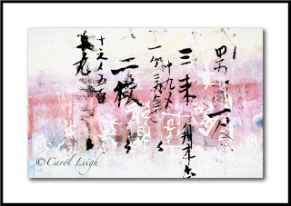
This one is a combination of 1937 Japanese ledger paper and a monoprint I made using acrylic paint. What I think is cool is how I made some of the background calligraphy white, a reverse of the black foreground characters. The color palette, too, is rather different for me.
Having fun here in Washington state, where the rhododendrons are coming into full bloom, the grass is green, and the air is fresh and cool.
©Carol Leigh
All text, photographs, and other media are ©Copyright Carol Leigh (or others when indicated) and are not in the public domain and may not be used on websites, blogs, or in other media without advance permission from Carol Leigh. Thank you!
Tuesday, April 12, 2016
Seduced by color


As I've been working in a lot of neutral tones lately, when I see some of my more colorful images, they sort of startle me, shake me up, and make me happy.
Here are three examples, two of which were "as found" and one a photomontage.
The "tickets" image was taken in San Diego, the longhorn skull on the front of a shop in Madrid, New Mexico, and the "P?" The background (including the stripes) is a reflection of a fishing boat photographed in Newport, Oregon. The "P," too, comes from a fishing boat. I like the repeating pattern of the stripes and the diagonal-ish lines in the background contrasting with the upright-ness of the letter.
Purple and orange is the theme of these three, apparently. I remember in eighth grade, living in Carlisle, Pennsylvania, receiving a bright purple mohair sweater from my Aunt Lucy, and loving it. Especially combined with an orange pleated skirt! Totally clueless about style then as I am today.
©Carol Leigh
All text, photographs, and other media are ©Copyright Carol Leigh (or others when indicated) and are not in the public domain and may not be used on websites, blogs, or in other media without advance permission from Carol Leigh. Thank you!
Monday, April 11, 2016
Lines and curves


As I continue to work on my black and white series of military fort details, I'm seeing how much easier it is to see line and design when not being distracted by color.
Color can seduce you into a photo, but composition, line, and design keep you interested.
Ooh, that sounded good, didn't it? (I was going to elaborate, relating it to bad relationships and life, but I won't go there. And aren't you glad?!)
In the first shot, I liked the contrast of the textured background behind the smooth railing. I also like the diagonal bits. And finally, I like the little rounded knob on the railing against all those incredibly straight lines.
Same thing in the second photograph. In this case I like the curve in the lower right, the curves of the round ring, both contrasting with the bold black horizontal line.
Then in the bottom photo, all we have are straight lines. The sharp edges of the steps, precisely cut, diagonating across the frame. I purposely let a bit of warmth come through in the background just to set off the steps a bit.
Gotta say, I'm enjoying this black and white work. And it's fun to go back through years of photos I've taken in various forts and bunkers and look at them with new eyes and new skills. And a new attitude.
©Carol Leigh
All text, photographs, and other media are ©Copyright Carol Leigh (or others when indicated) and are not in the public domain and may not be used on websites, blogs, or in other media without advance permission from Carol Leigh. Thank you!
Thursday, April 7, 2016
Latest work: "Winter Tree"
Whenever I create something, I usually think a) nope, this isn’t quite “there” yet, or b) this is crap, don’t show it to anybody, but keep it because I think it has potential, or c) yes, this is good, or, preferably, d) yes, this one’s solidly good. Option d) is always the preferable one, of course, and that’s the case with this image.
I get a solid “yes.” A definite “yes.”
I began making this image back in November of last year. Although a simple picture, it didn’t come together quickly, and it’s been in my “Works In Progress” file, waiting for a bit of inspiration. Which arrived yesterday. A few tweaks and boom, done, and uploaded to Fine Art America.
So I show it to you here today. You may not agree with my “yes” feeling, and that’s okay. The main thing is that it resonates with me, the artist, as well as with Chris. It looks best when you see it large on FAA. I’ve left it as large as I can here in the blog, but man, it looks great on the FAA site! The subtleties get lost in a thumbnail.
Wishing you a solid “yes” sort of day today. Oh, and here’s a shout-out to neighbor Shirley in Bend, Oregon. Wishing you a fine day today, madam.
©Carol Leigh
All text, photographs, and other media are ©Copyright Carol Leigh (or others when indicated) and are not in the public domain and may not be used on websites, blogs, or in other media without advance permission from Carol Leigh. Thank you!
All text, photographs, and other media are ©Copyright Carol Leigh (or others when indicated) and are not in the public domain and may not be used on websites, blogs, or in other media without advance permission from Carol Leigh. Thank you!
Labels:
"Winter Tree",
Carol Leigh,
FAA,
Fine Art America,
latest work,
photomontage
Wednesday, April 6, 2016
Things that probably only I find humorous ...
Walking along the street in Charleston, South Carolina. Luckily the two cars left just enough of a gap to let the store sign show through clearly.
It's just not funny if one has to explain these things . . .
©Carol Leigh
All text, photographs, and other media are ©Copyright Carol Leigh (or others when indicated) and are not in the public domain and may not be used on websites, blogs, or in other media without advance permission from Carol Leigh. Thank you!
Monday, April 4, 2016
A slightly different direction


When we moved here to Whidbey Island, one of my first goals was to photograph the military bunkers and gun emplacements on the island (and nearby). So I began doing that and, instead of creating color images, decided to work on toning them and/or creating black and white versions. They haven’t been successful in my opinion, so although the photography has been continuing, the processing has sort of gone by the wayside.
I was inspired to return to it for two reasons. Fay Henexson showed me some intriguing black and white photos that she had taken. (Here’s a link to her blog, but I couldn’t find the black and white images: http://henexson.zenfolio.com/blog/2016/4/abstracts-and-other-pleasures.) And I also have begun playing with Nik filters this past week.
I believe I’ve come up with a satisfactory way of making my images into black and white, which involves not only using the Nik filters, but a lot of other techniques as well. We shall see. It’s all an experiment.
Since I continue shooting and I also have a large backlog of photos taken over the years, I’ve got a lot of work to do. I’ll post some here from time to time as I move through. You know how excited I get about photographing in boatyards? Well, military bunkers do exactly the same thing. It’s all about texture, line, and design. Woo hoo!
©Carol Leigh
All text, photographs, and other media are ©Copyright Carol Leigh (or others when indicated) and are not in the public domain and may not be used on websites, blogs, or in other media without advance permission from Carol Leigh. Thank you!
Labels:
B&W,
Carol Leigh,
Fort Casey,
Fort Stevens,
Fort Worden,
Nik
Sunday, April 3, 2016
Latest work: "Burning Bright"

My project of late is making a wall hanging consisting of hand-made tags. (I'll post a photo here when it's done.) Each tag is sort of a mini-collage consisting of monoprints, torn papers, postage stamps, hand-painted images -- a veritable potpourri of weird but (I think) very cool stuff.
As I'm doing this, I'm bringing various images into the computer to see if I can create new photomontage work to submit to Fine Art America. This is one I created today. It has a celestial vibe to it yet sort of a primitive, jungle-ish vibe as well.
When I make these, I always check to see if they will work equally well as a square image, and in this case, yes, it did, as you can see.
Mild insanity right now in the studio as I'm making, collecting, painting, gluing, working on the computer, etc. And then this morning, early on a Sunday morning, around 5, all was completely quiet and still. I was wallowing in the silence when all of a sudden there was a loud, prolonged, high-pitched wail of a coyote, who must have been in our back yard no more than 20 yards away. That set off every other coyote in the area as well as every domestic dog who happened to be outside.
Lasted about 60 seconds, then silence. Except for the domestic dogs. Who always seem to want the last word.
©Carol Leigh
All text, photographs, and other media are ©Copyright Carol Leigh (or others when indicated) and are not in the public domain and may not be used on websites, blogs, or in other media without advance permission from Carol Leigh. Thank you!
Labels:
"Burning Bright",
Carol Leigh,
FAA,
Fine Art America,
latest work,
photomontage
Minimalism in a boatyard (part 2 of 2)
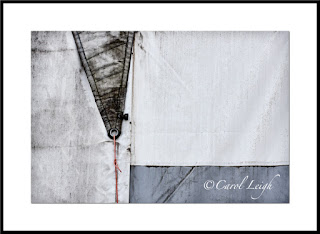
Continuing on from yesterday’s post about shooting stark, minimalistic images in a boatyard, here are a few more examples.
Canvas sails on a wall
My favorite image from the day is this first one, an abstract of a canvas sail-covered wall. It began as the full-frame second shot, which I also like, but I cropped it into a square. Why? Because all the “good stuff” begins just to the left of the darker triangle. The triangle leads your eye down into the frame to the red cord. Your eye then moves along the bluish horizontal bit and then over to the right.
Movement. The square format emphasizes both the shapes and the movement. It keeps your eyes on what I consider the heart of the design.
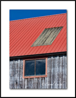
Building detail
More stripes. The first image, with the galvanized metal on the red roof, was taken later in the day than the second one, and the colors weren’t as saturated as they were in the second image, taken earlier in the morning in overcast light. So in Photoshop I pumped up the red roof and the trim in the first picture, leaving the wood and the sky as they were.
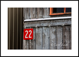
In the second shot, I frankly was going for the #22 and the vertical stripes. My dilemma was do I include part of the red-framed window or do I solely concentrate on the number and the vertical elements? Obviously I decided to include part of the window, but why?
I kept it because it creates visual movement in the frame. Your eye goes first to the #22, quickly notices the vertical lines to the left, but then immediately comes back to the number, and then follows the bold diagonal-ish line across the frame to the window, where the reddish-orange trim echoes the red surrounding the number. So your eye goes back to the number.
I like the repeating patterns of the vertical lines. I like how the number and the window stand out. The diagonal line moves your eye left-right and keeps the vertical lines from being boring. Pattern. Contrast. Movement. Works for me.
Texture
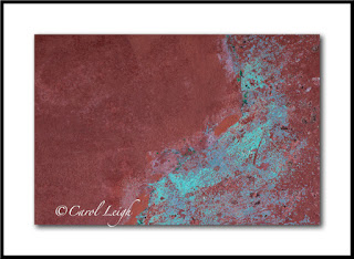
The cinnamon color looked great with the turquoise patina and immediately caught my eye. It’s not a standalone shot, but something I regularly find and photograph because I use things like this in my photomontages, combining the texture with something else.
Red fish
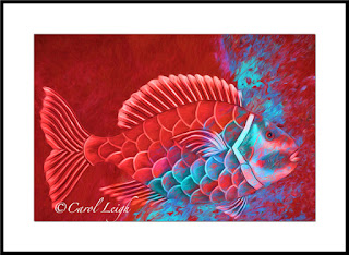
I didn’t find the fish at the boatyard (it was part of a sign I photographed in South Carolina). But just for grins, I thought I’d combine the texture shot with the fish photo and then play around using Topaz Impression. It’s unlike anything I normally do, rather gimmicky, but there’s something about it I like. Cool colors. Cool fish. Fun to make. Just thought maybe you’d be interested in seeing one use of the simple texture shot I got at the boatyard.
Blue arrow
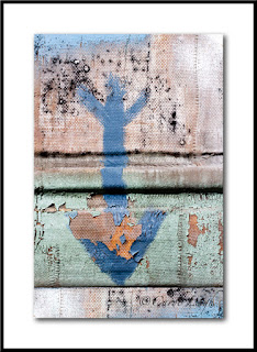
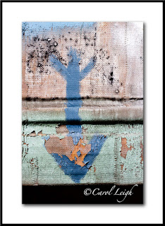
In the junkier part of the boatyard I found a piece of painted canvas, weathered by rain and sun so that the paint was peeling away here and there and it was just funky. Why photograph this? Because I “collect” arrows. As a standalone shot it doesn’t quite work, but I tend to shoot arrows whenever I find good ones, and this now becomes part of the mix.
The first arrow photo isn’t the original. The second one, with the black empty space at the bottom, is how the arrow actually looked. The canvas ended at the arrow’s point, nothing behind it. I purposely left the black space, knowing I could do something with it later, and that’s what you see in the first shot. I just added more canvas, more paint, more grunge down at the bottom and the picture seems more complete to me now.
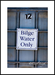
Bilge water
Finally, I took this picture for two reasons. It struck me as mildly humorous. I mean, when’s the last time you saw a container of bilge water? And secondly, I collect photos of signs. I don’t know when (if ever) I will use this picture, but here it is and it goes into the mix.
Why didn’t I move in close and shoot just the sign? Why include the container and the #12? Because just the sign would have been boring. Keeping part of the container in the frame gives the sign a bit of context; and the #12 indicates that there’s a lot more bilge water available if one should need it. At least 11 more containers!
By the way, my stock agency, Alamy, just yesterday sold a photo of a “No Parking” sign I took while on vacation in Breckenridge, Colorado. And it’s not the first time that sign has sold. See? You never know about signs.
So that was my day at the boatyard. Two blog posts showing you what I gravitated to, why, and a bit of how. This is my kind of photography. I leave the big pictures, the grandiose landscapes, the breathtaking scenery to other photographers. My talent and joy comes from being able to zoom in on little interesting bits, things you would find in a boatyard, around military bunkers, antique car shows, on the sides of buildings, at airplane museums, and in back alleys.
Simple, minimalistic shots that feature line, design, and movement. Hope you found it interesting and, perhaps, even inspirational.
©Carol Leigh
All text, photographs, and other media are ©Copyright Carol Leigh (or others when indicated) and are not in the public domain and may not be used on websites, blogs, or in other media without advance permission from Carol Leigh. Thank you!
Saturday, April 2, 2016
Minimalism in a boatyard (part 1 of 2)


On a warm(ish) sunny day in a boatyard, there’s a lot going on. Boats on slings being lifted out of the water, hulls being scraped, trim being repaired, welding, hammering, polishing, wood being planed, sanded, and painted. The noise and activity can be daunting.
Amid the sounds and chaos, it’s my challenge (and my delight) to find the little things, to wander around, watching, looking, trying to find lines and designs apart from and within all the busy-ness.
I’m not a big-picture kind of gal. A boatyard and all it has to offer me and my kind of photography makes me feel alive, giddy even. And so I look for structure, patterns, abstract designs. And I find them where no one else is looking.
My resulting photographs are stark and strong. Some could say empty and boring. And I understand that. But let me show you three photographs I made, and let me tell you why I like them. And isn’t that an important thing about photography, art, etc.? That you make or create a work that fills something inside you, and you are confident about the “why” behind it?
Red-trimmed building
The buildings in this boatyard are an interesting combination of new and made-to-seem-old, and I liked the contrast between the wooden red and blue building in front of a plain, metal building. What they had in common were stripes. Stripes are the unifying factor; old/colorful against new/blah was the jarring factor, the tension. In addition, the strong red diagonal lines of the foreground roof contrast with the repeating vertical lines in both buildings. And then the two rectangular windows, the focal point, give the photograph interest, a place for your eye to land, relieving the endless repetition of the stripes.
Did I think about all those little details before I took the shot? Nah. I looked up, thought to myself, “Cool building. Love the red trim against the blue. And stripes! How can I isolate all that against the background? Most importantly, how can I keep all those straight lines straight?” Knowing what draws me to the scene makes it easy for me to compose the image. Emphasize the good stuff, use the other stuff (if any), to create a bit of tension.
Boat hull
What caught my eye were the drip lines, where time and weather and infrequent maintenance created a repeating pattern of dark and light stripes, where rain and gravity and dirt worked their bit of artistic magic. I positioned myself directly in front of the boat, which sat on stilts slightly above me, so that I could capture both sides of the boat, with the strong vertical line on the right being where everything came together.
What drew my eye were the repeating drip patterns. What created the interest was the strong vertical line against the diagonal lines of the drip patterns. And then the plain part of the hull at the top contrasting with the busy feeling of the rest of the photograph.
Boat fender, or buoy
More stripes. The vertical buoy, the strong repeating pattern of black and white stripes, stands out and contrasts with the plain background and the three horizontal elements at the bottom and top of the shot. Busy against plain. Vertical against horizontal. The buoy caught my eye. My challenge was how to display it. My challenge was also the decision to either include or delete the little bit of blue up at the top. I decided to keep it since it echoed the color blue at the bottom and sort of “contained” the buoy.
What’s my point? I always know exactly what caught my eye, what attracted me to the scene, what I sort of instantly fell in love with. Once I know that, then the rest is easy(ish). How do I make what caught my eye “work?” What do I leave in? What do I leave out? What’s my background doing? Does it compete with my subject or does it enhance it?
The rest is technical. How much do I want in focus? Do I want a perfectly symmetrical shot, or do I want things slightly off-center? Why? Are my “horizon lines” level? Do I want this shot slightly lighter or darker? Is this something I can tweak in Photoshop, or do I create it here? Do I scrape that wad of chewing gum off the hull (ewwww), or do I plan to clone it out in post-processing?
The seeing always comes first. What drew me to the scene? The technical part comes second. Right brain/left brain. Yin/yang.
I think it’s a Gemini thing.
©Carol Leigh
All text, photographs, and other media are ©Copyright Carol Leigh (or others when indicated) and are not in the public domain and may not be used on websites, blogs, or in other media without advance permission from Carol Leigh. Thank you!
Subscribe to:
Comments (Atom)


