I met a delightful woman (Karen) while I was in Japan (as well as her equally delightful spouse, Chet) and she's been asking questions about submitting her photographs to Fine Art America. Excellent questions and I'm enjoying answering them.
Something came up this morning when I was working on this picture (a picture I am going to trash) that I thought might be helpful for Karen, so I sent her an e-mail. The e-mail was probably way more than she wanted to know, but the info was good. So good that I am going to copy it here.
Whether or not you're sending work off to be sold, it behooves you to really examine what it is you're sending/creating and make sure it's the best that it can be.
Regarding this picture, here's what I wrote to Karen:
I have worked for hours on this image and now, in the end, I’m going to trash it. I will not send it to Fine Art America. But why? It probably looks just fine . . . unless you move in closely.
Every image I send to FAA requires a lot of scrutiny. And so I blow the image up on the screen to 100%. And then I “walk the grid.” I’ll begin in the upper right and slowly move down the picture. Then I’ll move to the left a little bit, and will slowly move up the picture. Then move more to the left, and crawl down the picture.
Why be so picky? Because FAA will do the same thing before they print the image. And if the corners are soft, if there’s anything soft/out of focus that should not be, they will reject the print job, will contact me, and ask me to re-take the photo. Naturally, most of the time I cannot re-take the photo, so I’m basically screwed.
When I looked at this image, I found a lot of flaws. First of all, it’s a SCANNED image, i.e. I made a physical collage of paper and glue, put it on the scanner, and then added more elements to it in Photoshop. It’s extremely high in resolution. But if I did not walk the grid on this image, I wouldn’t have noticed that there was a hair embedded in the paper/glue combo, something that was in my original collage, but I never noticed until I blew it up in the computer. A little hair? So what! No one’s going to see that. But yes, they will when FAA blows up the picture. They’ll see it as clearly as I did when walking the grid. It makes me look like an amateur. So I fix the hair in Photoshop. No big deal.
However, I used a texture layer over the picture of the collage. And this is important to remember: my texture layer wasn’t as high a resolution as my picture. I had to enlarge the texture layer to fit over my picture. By enlarging this lesser-quality image, I stretched it so much that it lost detail. Often that won’t be noticeable, but in this case it’s horrible. It’s blurry. Sometimes I can fix this by using various tricks, but not in this case. My bag o’ tricks failed me.
My only solution is to go back to my original scan and then find a high-res texture to go over it. Luckily I’ve kept all my layers intact, so the three circles that are in this picture won’t have to be retrieved again, resized again, and blended again.
It is crucial that we “walk the grid” in our own photos before we send them to FAA. A tree branch that we added might come to an abrupt end an eighth of an inch before the edge of the frame. Maybe a masking job wasn’t done carefully enough. Maybe we didn’t crop perfectly. Maybe there's some sensor dust in the sky (and I originally thought those were gulls!) These are things that we can easily miss when working on a picture. But if we examine it at 100%, those tiny imperfections will loom large, enabling us to make corrections, enabling us to look more professional in our dealings with FAA and with our customers. Frankly, it’s a pain in the ass, but it’s what separates us from the bulk of what people are uploading to FAA.
So there you have it. I'm often shocked and appalled when I look at my work at 100%. It's therefore definitely worth it to me to spend a few extra minutes walking the grid, being picky, picky, picky.
Off my soapbox now to enjoy the day . . .
©Carol Leigh
All text, photographs, and other media are ©Copyright Carol Leigh (or others when indicated) and are not in the public domain and may not be used on websites, blogs, or in other media without advance permission from Carol Leigh. Thank you!
Showing posts with label how-to. Show all posts
Saturday, March 7, 2015
Saturday, February 28, 2015
What I'm Working On: More Monoprint Mania


When making my monoprints, I’m usually using 9x12 drawing paper, which is larger than my 8x10 Gelli plate, so there are often empty white spaces here and there on the paper which I don’t particularly care for (as you can see in the first photo). What to do?
When I bring the print into the computer (either by photographing it or scanning it), I can crop the monoprint so that the white areas off to the sides don’t show. But I can also use a Photoshop technique called “Content Aware Fill,” and Photoshop will arbitrarily fill in those white areas using the surrounding pixels of color as its guide, as you can see in the second photo.
If you’ve never used “Content Aware Fill” in Photoshop, look it up! It’s an easy and useful tool that I use all the time, so much so that I created an action for it which enables me to simply select where I want the effect to appear, click the action, and hoo ha!
But back to the monoprint. I don’t think it’s all that wonderful, frankly, as it stands, but I may make an envelope out of the physical print and it’ll look pretty good. As a framed physical print? Nope. It’s not interesting enough to me. But wait!
In the computer, using Photoshop, I cropped the image down to a square format and added some circles (third photo). Okay, now that’s better. This is worthy of sending off to Fine Art America for sale. But there’s even more.
Using Photoshop, I copied my original layer, flipped it, and applying two different blending modes created the two zig-zag versions you see in the last two photos. Not bad. And they could even be sold as a series along with the one with the circles. They would also look good as throw pillows, don't you think?
So there you have a peek into my little world, where I’m using paint, glue, scissors as well as computer technology to bring everything together. And you wonder what I do with my time? Well, this is a big part of it.
©Carol Leigh
All text, photographs, and other media are ©Copyright Carol Leigh (or others when indicated) and are not in the public domain and may not be used on websites, blogs, or in other media without advance permission from Carol Leigh. Thank you!
Labels:
Carol Leigh,
how-to,
monoprints,
what I'm working on,
WIWO
Friday, July 25, 2014
Quick way to intensify color in Photoshop

Let's say you took a photo and it looks really blah. There are a lot of ways to make your photo pop, but here's a really fast and easy way to do it.
In Photoshop, make a duplicate layer of your photograph. With the duplicate layer active and on top, change the blending mode to "Multiply." That's it!
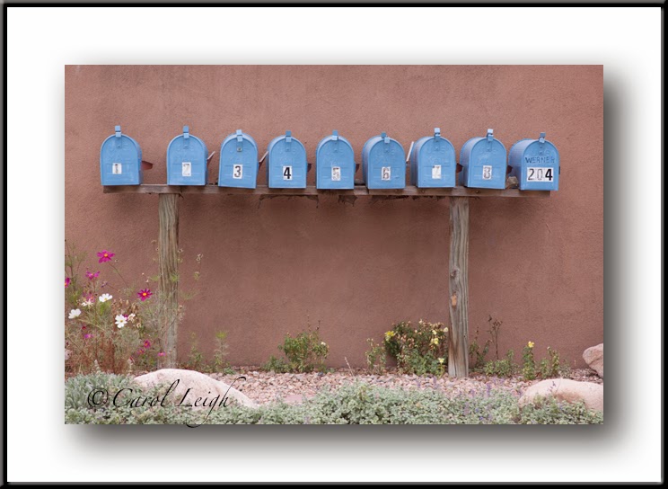
Here, let me show you an example. I took a photo of a row of blue mailboxes in Santa Fe. As you can see in the original untouched photo, the photo has no depth, no oomph, no drama. So I brought it into Photoshop, made a duplicate of the original. Then changed the blending mode to "Multiply."
I might have toned down the "Multiply" effect a little bit by using the opacity slider, but that's it. Huge difference, no?
©Carol Leigh
Wednesday, December 21, 2011
Got color?
While in San Diego I saw a bright red building. When I see color like that, I immediately begin wondering what I can find in FRONT of it. I first tried focusing on the bark of a palm tree, but that didn't work so well. What DID work was this giant bird of paradise plant growing right in front. (Click to enlarge.)
What makes it stand out? A few things...
First, there's the magic number of THREE. Three stems branch out from the base of the plant.
Then there are the diagonal lines, which give a feeling of movement.
Then look at all the red triangles here: left, lower right, another to the left of that one, and the tiny one at the very top.
Finally, we've got complementary colors of red and green, each of which makes the other look especially good.
The final result is colorful, bold, clean, simple, and smooth with just a hint of contrasting texture along the raggedy edges of two of the stems.
©Carol Leigh, wishing you a colorful, bold, clean, simple, and smooth life with just a hint of contrasting texture along your raggedy edges . . .
What makes it stand out? A few things...
First, there's the magic number of THREE. Three stems branch out from the base of the plant.
Then there are the diagonal lines, which give a feeling of movement.
Then look at all the red triangles here: left, lower right, another to the left of that one, and the tiny one at the very top.
Finally, we've got complementary colors of red and green, each of which makes the other look especially good.
The final result is colorful, bold, clean, simple, and smooth with just a hint of contrasting texture along the raggedy edges of two of the stems.
©Carol Leigh, wishing you a colorful, bold, clean, simple, and smooth life with just a hint of contrasting texture along your raggedy edges . . .
Monday, December 12, 2011
Squarification

Sometimes when I create my photomontages, I'll create two different versions, one rectangular and one square. And it's interesting to see the different feel between the two. Sometimes I like one version, sometimes the other, but it's always good for me to create them both, just to have a comparison.
I'll often begin these pieces and then walk away from them for a week, a month, a year, to revisit them later with new eyes. That's what happened here. I knew I had SOMEthing, but wasn't sure what, when a couple of months ago I began working on this. It all came together yesterday.
This photomontage was made from a variety of photographs, including typewriting on onionskin paper, peeling paint, a scratch on the side of a train car, a bit of red paper, part of a wall in Mexico, an adding machine tape, etc.
This "squarification" concept works well in "normal" photography as well. Let's say you have a landscape and you've composed your photo so that the barn is more toward the left side of the horizontal frame. What if you were to crop away some of the right-hand side? You may find that now your barn looks pretty prominent; all of our attention goes to the barn rather than wandering around a larger frame. Sometimes this is good, sometimes not, but the key thing is to THINK about the possibility of squaring your frame when you're taking the photograph.
Try it. Take the perfect landscape shot. Then think, "what if this were a square format?" Recompose your photo and take it again.
And think about photographs you've already taken. What if, on a cold and rainy day, you were to rummage around in your computer, looking for images that might benefit from being presented in a square format? You might be surprised (pleasantly) at what you find.
©Carol Leigh, who squarifies more often than not . . .
Tuesday, October 11, 2011
All you need is one leaf


We dream of orange and yellow aspens flowing down hillsides like lava, leaf-strewn country roads, fiery red maples framing a covered bridge. But sometimes Mother Nature doesn't cooperate. Freezing storms turn the leaves black; wind blows the leaves from the trees; or autumn didn't arrive the same time you did (or left too soon).
But surely you can find ONE leaf to shoot! One good leaf to evoke a feeling of fall. Which is what I did yesterday. We have a few red-flowering currant bushes in our back yard (kind of — the deer snack on them). I picked up a fallen leaf, put it in a book for a couple of days to flatten it, then took it out to the studio to photograph.
I rummaged around, found some various papers to put it on, and began shooting. The orangey-red photo is the leaf on handmade paper; the blue/brown photo? Hand-painted Japanese paper. Next is the leaf placed on top of a piece of rusty metal that Chris found (this one's my favorite), The golden photo is the leaf on a piece of paper that I painted with watercolor paint. And finally, you see the leaf on a piece of paper I used to clean my paintbrushes. This is just the tip of the iceberg; I have more than 30 variations from this one shoot.
What's my point? We have expectations of what we'll find this fall, what we'd like to shoot. Sometimes those expectations aren't met (especially for those of you in California's eastern Sierra right now). Rather than bemoan the fact that you're not seeing what you want to see, look around and see what's there. Put a leaf on a rock, on a bed of pine needles, float it in a stream, or, like Stacy B. did one year, lick the leaf and slap it onto the trunk of a tree to shoot at eye level!
All it takes is one leaf and a decent background. Happy fall! ©Carol Leigh
Wednesday, August 31, 2011
Tracing paper, pen, watercolor


I'm having major computer problems, so decided to post this sequence of photos that I did a couple of years ago. The photos are old, but the process is kind of interesting.
I put a piece of tracing paper on top of a woman's face in a magazine. I used a pencil to draw the shape of the face, the lips, eyes, nose, etc. and then went over the lines with a Sharpie marker. You can see, in the first photo, where I didn't do a good job of erasing the pencil marks.
I used very diluted watercolor paint to color the lips, the eyes, etc.
In the second photo, I changed the light balance in Adobe Camera Raw to "cloudy," which gave the picture a warmer, more golden tone. But it still doesn't look very good.
So I applied Topaz Adjust "Simplify" to the photograph and then cropped it. The "Simplify" feature in Topaz made the golden colors glow, smoothed things out in general, and gave the image a softer, more painterly, more graphic look. It's more polished than the previous two versions.
This winter, when you're stuck in the house because it's raining out, give it a try. Tracing paper, a pencil, a black marker, a magazine, a touch of watercolor, and then take a picture of what you drew. What do you think? ©Carol Leigh
Subscribe to:
Posts (Atom)