Showing posts with label orange. Show all posts

Wednesday, December 18, 2019

Unintentional art . . . corrugated metal


"Unintentional art" generally refers to anything that was created with no real artistry in mind, something functional, ordinary, accidental, but, from the standpoint of an artist looking at it, is amazingly, accidentally artistic. I find this sort of thing all the time and take exceptional delight in it.

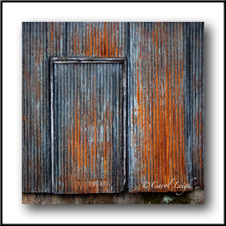
Here's an example. While walking down a street in Kyoto, I came upon an old rusty metal wall. Most people wouldn't take a second look. Except me.

There's so much to love about this little scene. The weathered metal, the wavy corrugations that give the metal depth, the gorgeous color of the rust, the complementary colors of blue and orange, the mysterious door with no handle, no doorknob, the soft light which creates a lovely glow.

Teaching photographers to see is a huge challenge for an instructor. I've always said, "You can't shoot it if you don't see it." Awareness is everything. So this bit of unintentional art, accidental art, commonplace materials, if you are aware, jumps out and just begs to be photographed. Or painted. Or simply admired. A wonderful gift to those who really look.

©2019 Carol Leigh

Friday, March 1, 2019

Before and after . . .


Back in 2012, I won a bid on eBay. Someone in Europe was selling 14,000 Czech matchbox labels. 14,000! I debated whether or not to bid, and, encouraged by two alleged friends, I entered a low amount, and to their surprise and delight I won the bid. And I'm thinking, uh-oh.

They (the labels) arrived a couple weeks later, all packaged nicely, sort of like Saltines when they used to be in those long, waxed-paper-like tubes.

I began poring over these small pieces of paper like some crazed philatelist, dividing them into groups of like subject matter, wondering what the hell am I going to do with these now? There were five in particular that depicted sports. I liked the overall simplicity of the artwork and the interesting color palette.

So here you see how the matchbox label looked originally, and then you see how I added a background, adding a bit more size and a bit more drama.

I’d not thought of these labels until today, when I was looking for examples of the color orange — my Photomotivation assignment for the month of March. Looking at more of the labels, I’ve got even more ideas. One down, only 13,999 more to go!

All text, photographs, and other media are ©Copyright Carol Leigh (or others when indicated) and are not in the public domain and may not be used on websites, blogs, or in other media without advance permission from Carol Leigh. Thank you for your understanding and kindness.

Saturday, July 8, 2017

Experimenting


This picture was taken years ago in Tillamook, Oregon. It's the headlamp on a very old water truck from the Corvallis fire department.

I like the repeating vertical lines on the left, the diagonal line on the right, and how the round shape of the headlamp softens the strong, straight lines in the rest of the image.

The bright orange color is a bonus. Or is it?

If what I like is the DESIGN of the photo, the color overpowers the design, making ORANGE the first thing you notice. How can I change that?

Would a black and white treatment emphasize the lines, the circular element, and make the photograph more about composition rather than color?

So yeah, that's what I did. I turned the image into a strong black and white, but then allowed just a hint of color to come through here and there to add interest.

What do you think?

©Carol Leigh
All text, photographs, and other media are ©Copyright Carol Leigh (or others when indicated) and are not in the public domain and may not be used on websites, blogs, or in other media without advance permission from Carol Leigh.

Monday, November 21, 2016

The power of wonkiness


These letters look cool together. The top one, I believe, was on the side of a fishing boat, and the lower one was on the side of a shipping container in a salvage yard in Washington.

The rusting metal, the overall texture, and how they each have similar colors is what I find appealing. And their wonkiness gives them more energy, more life, than if they'd been perfectly level.

©Carol Leigh
All text, photographs, and other media are ©Copyright Carol Leigh (or others when indicated) and are not in the public domain and may not be used on websites, blogs, or in other media without advance permission from Carol Leigh.

Saturday, May 28, 2016

Color, food, and laughter


Our friends Rich and CJ are here visiting for a week and what I'm especially loving is all the laughter. Photography is sneaking in there, as are some fine meals, but the laughter is what is feeding my soul.

Yesterday we ventured out and found some brilliant colors in Greenbank. I was shooting with my iPhone and then created these two painterly images using some Topaz filters. Fun stuff. Lightweight, but fun. And pretty. And yeah, the colors were really this brilliant.

The pansies were floating in water in an orange glass birdbath. How could we pass them by? And the Oriental poppy? Just one in a big patch of them.

Wishing you friendship, good food, and lots of laughter this Memorial Day weekend.

©Carol Leigh
All text, photographs, and other media are ©Copyright Carol Leigh (or others when indicated) and are not in the public domain and may not be used on websites, blogs, or in other media without advance permission from Carol Leigh.

Monday, January 4, 2016

Industrial art . . .


A bit of colorful whimsy on a drizzly afternoon. Loved how these downspouts on the side of a building in Anacortes, Washington were artistically done as watering cans. Very cool idea.

©Carol Leigh
All text, photographs, and other media are ©Copyright Carol Leigh (or others when indicated) and are not in the public domain and may not be used on websites, blogs, or in other media without advance permission from Carol Leigh. Thank you!

Friday, June 19, 2015

ROYGBIV: ORANGE!


Go to an antique/classic car show and you're bound to find at least one outrageously orange car. I'm not so sure I would want to have an orange car, but I just love photographing them.

This coming weekend I'll be missing two different car shows -- one on the Oregon coast and another on Whidbey Island. Alas. But there will be more to come, and always with at least one orange car.

The first photo essay I ever sold was all about antique cars. Not the whole car, just the "parts." That was so long ago. But my love for the close-up and the abstract remains today.

By the time you're reading this, we are en route from Oregon to Whidbey. With the cat riding shotgun . . .

 ©Carol Leigh
 All text, photographs, and other media are ©Copyright Carol Leigh (or others when indicated) and are not in the public domain and may not be used on websites, blogs, or in other media without advance permission from Carol Leigh. Thank you!

Sunday, June 14, 2015

Latest work: "Signpost Up Ahead"

This is a photomontage I made that includes my photos of various painted papers, patterns on the side of a fishing boat, and painted circles. I particularly like the bold, bright colors, the southwestern feel, and, yeah, just the overall weirdness.

©Carol Leigh
 All text, photographs, and other media are ©Copyright Carol Leigh (or others when indicated) and are not in the public domain and may not be used on websites, blogs, or in other media without advance permission from Carol Leigh. Thank you!

Tuesday, May 26, 2015

Abstracts anywhere . . .

During an early-morning walk along the bayfront, I spotted all these bright orange chairs stacked up in front of a restaurant. I wish I'd taken a "before" photo to show you what I saw, but the chairs stacked beautifully and I spotted this little composition.

What do I like about this shot? Let me count the ways:

1. Outrageous color. Reddish-orange is an eye-catcher.

2. Repeating patterns. One curve is terrific; more curves make more of a statement. One bright chrome line is good, four make us pay more attention.

3. Movement. I like how the four chrome elements lead our eye up along a diagonal line. I like how the curving elements on the left (not unlike a cockatoo's crest) branch away from the "core" chrome lines and encourage our eye to swing upward and away. And I like how the horizontal repeating elements lead our eye off to the right and somewhat down. There's a lot of movement going on in this simple composition.

4. Contrast. Your eye probably noticed the color first and then went immediately to the four chrome elements. Why? Because they're the lightest/brightest things in the photo. And then there's the contrast between severe, straight lines and the softer curving elements in the orange sections.

If I were to prep this photo again, I might crop in from the left so that tiny bit of chrome there in the lower left didn't show. I find my eye going back there again and again, so it's a distraction, not a compositional element. My photo is all about color, line, simplicity, and movement. That little bit of chrome showing through doesn't add to my concepts of color, line, simplicity, and movement. It should go, don't you think?

©Carol Leigh
All text, photographs, and other media are ©Copyright Carol Leigh (or others when indicated) and are not in the public domain and may not be used on websites, blogs, or in other media without advance permission from Carol Leigh. Thank you!

Tuesday, February 18, 2014

Number 5 Flotation Device

A lot of my work is done using muted colors of sepia, brown, black, grey, etc. During this rainy Oregon winter, I decided to shake things up a bit and put some color into my life. So here is this big number 5, seemingly floating in a sea of yellow and red and orange.

Created on a (yes) Mac . . .

©Carol Leigh