Saturday, May 2, 2015

Sow's Ear/Silk Purse


It's sort of drummed into us photographers that if you begin with a bad photo, no amount of tweaking and altering will make it a good photo. And yeah, that's usually the case. But every once in awhile the angels sing and you can make a silk purse out of a sow's ear.

(To produce something refined, admirable, or valuable from something which is unrefined, unpleasant, or of little or no value.)

Chris and I were wandering around Silverton, Oregon and I saw a bicycle in front of a store. You can see what I saw in the second photo below. And yes, it's a ho-hum picture. The lighting was rather dull. The background was fussy. And you can even see my light-colored pants and dark sweater reflected in the glass just over the handlebars.

Normally I would automatically delete such a photo. But then I wondered just what could I do with it? I basically liked the bike.

I created this a number of years ago and don't remember everything I did, but I know I added some contrast, added some texture, added more content on the far left and right sides of the picture (the picture was wonky, so I rotated it, cropped it, and you see the white background/empty space on either side in the original photo). I also darkened the edges, added some shading, and then added an arrow in the upper right.

Why did I add the arrow? Because I purposely placed the bike more to the left side of the frame than the right to give it "moving room," room to coast into the frame. To emphasize that left-right movement, what better than to put an arrow in the shot? It's subtle, it blends in, and it's appropriate.

You can still see me reflected in the glass, but if I hadn't told you the reflection was there, you probably wouldn't have noticed it, and you wouldn't have recognized it as a person standing there.

Bottom line? Yes. I began with a boring photograph. But with a bit of tweakage and Photoshop legerdemain, I managed to transform it into a picture that has richness and depth. And it's one that I printed, framed, and have as part of a grouping on my living room wall. And it looks good!

©Carol Leigh
All text, photographs, and other media are ©Copyright Carol Leigh (or others when indicated) and are not in the public domain and may not be used on websites, blogs, or in other media without advance permission from Carol Leigh. Thank you!

Friday, May 1, 2015

May is National Bike Month

It's National Bike Month! Ride in style!

©Carol Leigh
 All text, photographs, and other media are ©Copyright Carol Leigh (or others when indicated) and are not in the public domain and may not be used on websites, blogs, or in other media without advance permission from Carol Leigh. Thank you!

Wednesday, April 29, 2015

iPhone photos . . .


Had to have the car serviced in Corvallis yesterday and, as usual, we walked through some of the back alleys so I could find grunge, texture, maybe something weird.

I have a good eye for composition, but post-processing on the phone is a real challenge. Most of these were processed using Photo Toaster and Snapseed. I then brought them into the desktop computer, put the black frames around them with my signature, and then they're ready to upload.

Much more study and experimentation in the future, but for now, I continue slogging along. I have the utmost admiration for those of you who do this well.

©Carol Leigh
All text, photographs, and other media are ©Copyright Carol Leigh (or others when indicated) and are not in the public domain and may not be used on websites, blogs, or in other media without advance permission from Carol Leigh. Thank you!

Monday, April 27, 2015

Abstracts anywhere . . .

As I am disassembling my studio, finding things long forgotten, throwing items away, and prepping for an upcoming garage sale, I came across a red silk scarf that I used a LOT as a simple background.

Remember my online assignment I called "Office Art?" Well, this is a good example of how we can find beauty in the simplest of things, such as a pair of scissors. And the red scarf worked well to set off the clean form of the scissor handles.

But what I really like is how a nearby turquoise piece of fabric reflected in the metal, creating subtle strips of bright blue here and there.

Interesting: A bold form, a bold background, contrasting with the subtle bits of reflected blue. And then the rounded forms contrasting with the more linear or straight lines. A yin-yang sort of thing. All in a photograph of an ordinary pair of scissors.

The silk scarf, purchased in the mid-1980s and which looked particularly good with a black silk dress, was wrinkled, worn, and dirty, with lots of little holes in it. I reluctantly relegated it to the trash. And on we move.

©Carol Leigh
All text, photographs, and other media are ©Copyright Carol Leigh (or others when indicated) and are not in the public domain and may not be used on websites, blogs, or in other media without advance permission from Carol Leigh. Thank you!

Friday, April 24, 2015

iPhone photo...


Abby in a packing box, not wanting to be left behind. Wish we could just keep her there... Addendum: Now that I see this photograph on my desktop computer, I'm amazed appalled at how overexposed it is. It looks much darker on my iPhone. Am going to have to begin purposely underexposing, apparently, when I shoot. What I see on the iPhone looks terrific; here, it looks awful! Embarrassing, but I'm going to leave it here. Sigh. ©Carol Leigh 

Thursday, April 23, 2015

iPhone photo ...

Waiting in line for the ferry...

iPhone photos ...


Determined to continue with iPhone photography, even though I find it frustrating. Am on Whidbey Island right now, no DSLR in sight, so out comes the phone. Sleepless in the middle of the night, so I decide to process a few.

Looking up at the front of the Staples store in Oregon through a rainy windshield. And then a shot of my friend's placemats hanging over a chair rail. Back on the road to Oregon today. 


Sunday, April 19, 2015

Changes are afoot . . .

We’ve been living here on the Oregon coast for almost 13 years — the longest I’ve lived anywhere — and it’s been great. So close to the ocean, clean air, everything’s green, bald eagles, whales, seals and sea lions abound. Beautiful vistas wherever you turn. Mild temperatures. Nice neighbors, neighbors who feed the cat while we’re gone.

So what’s the problem? Who would want to leave this?

Well, the rain is a big factor. Sixty to 90 inches a year? That’s serious weather. Rain moving horizontally up the street? Gusts of wind up to 70-80 mph? That’s significant. An airport that’s 3.5 hours away? It’s proven inconvenient, requiring hotel stays, both coming and going. A major city that’s also 3.5 hours away? To go to Portland for any sort of event is an effort.

So where would be a “better” place to live? Where could we go and still be in a maritime environment? A more benign climate? A rural area with easy access to a big city? A place where there are a few more options for exploring? A bit more property around us? Fresh air, a cool climate, but less rain? A sort of artsy place?

We gave all this a lot of thought. We’re 13 years older now, moving is a huge deal. And we have a lot of stuff — tools, books, computer paraphernalia, camera gear, and art supplies. Oh, my.

Plus, I have all my CalPhoto research material, all those binders of wildflower reports, all those articles I've written about where to shoot in California. My career of 30-some years and all its attendant paperwork. Do I just dump it all into recycling? And what about all those slides? Do I just toss ‘em out?

Thinking of moving is daunting. To physically do it will take a toll on the old bodies.

What to do, what to do?

We decided to move. We bought a house and escrow closes this Tuesday. We are prepping the Oregon coast house to show and sell. And we hope it will sell fast. It should. It’s in good shape (except for that one time the raccoon broke into the back yard shed!), and you can see whales from the kitchen and living room windows. And at night, the lights on fishing boats twinkle offshore.

Are we insane to leave this? I guess we’ll find out.

So where are we moving to? Whidbey Island, located in the Puget Sound, just north of and a 15-minute ferry ride west of Seattle.

But isn’t it cold and rainy up there? It’s not any colder than here on the Oregon coast. And rain? Sixteen to 20 inches a year! Compared to the Oregon coast, it’s practically a desert! We are on 2.5 acres, can’t see our neighbors, and can’t be seen from the road. Ahhhhhh! (The photo up top is our back yard. We're gonna need a lawn mower . . .)

We’ll be living in Coupeville, a cute little town. The island itself is a nice combination of small touristy towns, rhododendron gardens, and rural/agricultural areas (great farmers’ markets throughout the summer). A Navy presence is at the north end of the island (I’ll feel at home). We have a distant view of the sound, nothing like we have here, but there are water views everywhere you go, and lots of boat traffic (sailboats, ferries, cruise ships, freighters, and more).

The Pacific Northwest School of Art is located in Coupeville, which is great. Exploration possibilities include driftwood- and pebble-strewn beaches, the tulip fields in the Skagit Valley, military bunkers, Vancouver Island, Butchart Gardens, Port Townsend, the Olympic Peninsula, and then there’s all of Canada!

So yeah, we have had a wonderful run in Oregon and are sad to be leaving the state. But this will probably be our last grand adventure, giving us a whole new palette of colors — quick trips to Seattle, a Costco that’s closer, the Seahawks, orcas, a larger studio for me, and room for Chris to make stuff and to cook with gas!

We will remain Oregon residents until we sell this house, gradually moving our stuff north, staying longer and longer each time.

So it’s official . . . FOR SALE: 2BR/2BA 1,700 square-foot home with ocean view, light, bright, airy, and nice neighbors. Raccoons optional . . .

©Carol Leigh

Thursday, April 16, 2015

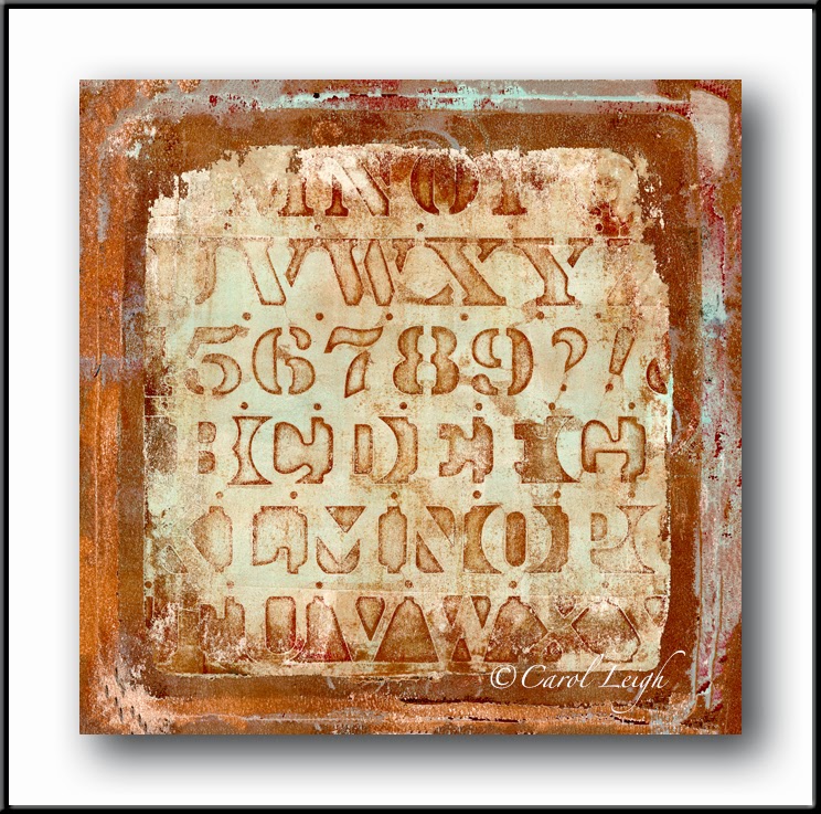
Latest work: "Writing on the Wall"


I'm returning to my "works in progress" files to see what I made a year or more ago, but then set aside because they didn't seem "finished," and then now to add additional items to FINALLY consider them done. The result is that I was able to upload nine new images to Fine Art America this morning, including these three.

I'm tempted to have them made into pillows for myself! I love the soft colors, the subtlety of the calligraphy, the feeling of texture. These will look really good in the house, methinks. We shall see . . .

©Carol Leigh
All text, photographs, and other media are ©Copyright Carol Leigh (or others when indicated) and are not in the public domain and may not be used on websites, blogs, or in other media without advance permission from Carol Leigh. Thank you!


Just because I could . . .

Quinn and Betty celebrate the new year with their usual flair.

©Carol Leigh
All text, photographs, and other media are ©Copyright Carol Leigh (or others when indicated) and are not in the public domain and may not be used on websites, blogs, or in other media without advance permission from Carol Leigh. Thank you!

Wednesday, April 15, 2015

Latest work: "Flotsam"

This is a combination of a couple different photomontages, to which I added some flotsam-y bits.

And, in honor of National Library Week:

“Whatever the cost of our libraries, the price is cheap compared to that of an ignorant nation.” 
-- Walter Cronkite


©Carol Leigh
All text, photographs, and other media are ©Copyright Carol Leigh (or others when indicated) and are not in the public domain and may not be used on websites, blogs, or in other media without advance permission from Carol Leigh. Thank you!

Monday, April 13, 2015

Latest work: "Red Planet Full Moon"

I have a "works in progress" file where I keep photomontages that, to me, don't seem quite right, or unfinished.

Rather than throw them out (and lose all that time and effort), I hang onto them, hoping that with a bit of time and maybe fresher eyes I'll figure out how to turn them into something special.

And that's what happened here. I pulled up a photomontage that's been hanging around and added a couple more things to it.

First of all, I'd removed an old oil painting from its frame and found the back side more fascinating than the front. The canvas had cracks in it, lots of texture, lots of thin spots, and was very brown. Perfect! So I shot it, added it to my base photomontage and liked how warm the image looked.

But it still needed something else.

So I photographed the case of an old watch (which even had a bit of the jeweler's fingerprint remaining on it) and created my full "moon."

And so, ta da! here you have my latest work: "Red Planet Full Moon."

In addition, as part of National Library Week:

“I think the health of our civilization, the depth of our awareness about the underpinnings of our culture and our concern for the future can all be tested by how well we support our libraries.”
— Carl Sagan

©Carol Leigh
All text, photographs, and other media are ©Copyright Carol Leigh (or others when indicated) and are not in the public domain and may not be used on websites, blogs, or in other media without advance permission from Carol Leigh. Thank you!


Sunday, April 12, 2015

National Library Week

As you all undoubtedly know, this is National Library Week (April 12-18, 2015).

I remember waiting excitedly for the bookmobile to come by while we were living in Hawaii. Not quite the same as a brick-and-mortar building, but a treat nevertheless.

And I worked at the Cal State Long Beach library for awhile. You know those cards in the old card catalog files? Yup, some of that is my work!

But what I especially liked about libraries were the possibilities. You could go in and look up anything. If you couldn’t find it, the reference librarian certainly could (bless them).

Because we moved so much during my first 18 years, a library was a place I could go and not stand out as the new kid in school, where I could read and be quiet and go unnoticed. They were a safe haven.

So here’s to libraries, librarians, and all the possibilities they have given us, and continue to give.

“We read to know we’re not alone. We read because we are alone. We read and we are not alone. We are not alone.” — Gabrielle Zevin, The Storied Life of A.J. Fikry

©Carol Leigh
All text, photographs, and other media are ©Copyright Carol Leigh (or others when indicated) and are not in the public domain and may not be used on websites, blogs, or in other media without advance permission from Carol Leigh. Thank you!

Wednesday, April 8, 2015

It's a good day to . . .

. . . remember a carefree day in the past.

We are beginning to pack, preparing to move (more about that later) and so I'm finding things not seen for some time.

This picture of me is one I love. I love how happy and carefree I look, how I was having fun, running toward a parent (on the boardwalk in New Jersey). How old was I? Maybe five? There are no parents now to ask.

What I love is this exuberance just to be alive, healthy, outdoors, having fun, being loved.

May all our days be just as wonderful as this.

©Carol Leigh
All text, photographs, and other media are ©Copyright Carol Leigh (or others when indicated) and are not in the public domain and may not be used on websites, blogs, or in other media without advance permission from Carol Leigh. Thank you!

Friday, April 3, 2015

Makes me feel good . . .

Someone in Greece purchased this picture ("Inherent") a week or so ago via Fine Art America. I never really know anything about the purchaser or the sale other than where it went, how it was framed (canvas wrap, matted, on metal, just a print, etc.), and how big it was.

There is, however, a section on FAA's website where they post buyer reviews and feedback as they come in, both good and bad. I always check that section to see (a) how FAA is doing with the quality of their work (are the colors true, did the picture arrive in good condition, are people complaining) and (b) how the buyer(s) liked the image.

This morning I saw this image show up and the buyer wrote: "It's in my living room now in a beautiful frame. Me and my wife love it. Thanks. --G.K."

It's always pleasing (and reassuring) to know that the buyer truly likes what he/she purchased (these things ain't cheap) and also to know that the buyer took the time to write back, to offer feedback.

Personally, I love this image. I like the rich colors and I like the uniqueness of my technique (blending and merging bits and pieces of various photos together). But no matter how confident and pleased I am about something I've created, for some reason it just isn't complete until it comes full circle. That art needs to be seen. It's a bonus if it's received well, but I think it truly does need to be seen for the circle to be complete.

Would I make these things if no one saw them? Probably. Would it be as rewarding? Probably not. And not nearly as much fun!

So thank you to G.K. who bought this picture. A picture that's now hanging somewhere in Greece. Opa!

©Carol Leigh
All text, photographs, and other media are ©Copyright Carol Leigh (or others when indicated) and are not in the public domain and may not be used on websites, blogs, or in other media without advance permission from Carol Leigh. Thank you!

Thursday, April 2, 2015

Latest works . . .


I'm sort of in a postcard rut these days. My actual photography doesn't seem to exist at the moment (taking care of various things lately and not carrying around the big camera; disenchanted with the quality of the iPhone), so when I need to create something, I'm rummaging around in previously-taken images to see what I can put together.

Here we have one rather monochromatic image ("John Dory Fish Postcard") and a colorful one ("Crow in Orange and Pink").

Have I told you how much fun I have making these? Well, I'm having fun making these!

©Carol Leigh
All text, photographs, and other media are ©Copyright Carol Leigh (or others when indicated) and are not in the public domain and may not be used on websites, blogs, or in other media without advance permission from Carol Leigh. Thank you!

Monday, March 30, 2015

A fish tale . . .


Chris and I visited the Pacific Maritime and Heritage Museum yesterday to attend a gyotaku (fish printing, or fish rubbing) demonstration conducted by artist Bruce Koike.

He has a good sense of humor, was interesting, and informative.

After the demonstration, I showed him the picture below, a picture of a gyotaku painting my mom had done in Japan in 1961 or 1962. (A painting that was so sun-bleached it was almost impossible to see, so I tweaked it in Photoshop to bring out the details and then added my own touches to it.)


I asked him what type of fish it was (rockfish). And then he called over Sachiko-san and asked her if she could read the characters in the lower right. She could! As she sounded them out, I realized she was saying my mother's last name. Apparently the characters are a phonetic rendition of the name Collister.

Bonus on three levels: an interesting demonstration, a revelation from the past, and a relaxing couple of hours on the Oregon coast.

©Carol Leigh
All text, photographs, and other media are ©Copyright Carol Leigh (or others when indicated) and are not in the public domain and may not be used on websites, blogs, or in other media without advance permission from Carol Leigh. Thank you!

Wednesday, March 25, 2015

Latest work: "Summer Sunshine"

Acrylic on paper. I make a lot of monoprints and occasionally turn them into envelopes, and that's what you see here: the front of an envelope. I'm particularly fond of the bright, summer-like colors, how there are mysterious circles and numbers hidden below the surface, and then the two "sticks" angling off on the left.

©Carol Leigh
 All text, photographs, and other media are ©Copyright Carol Leigh (or others when indicated) and are not in the public domain and may not be used on websites, blogs, or in other media without advance permission from Carol Leigh. Thank you!

Tuesday, March 24, 2015

Latest work: "Winter Nights" and "Winter Rains"


It rained heavily and steadily all night and when I awoke, I made a large series of “Winter Rains/Winter Nights” abstract images. I’m drawn to the dark, rich colors of warm browns and varying blues, as well as the strong linear and circular elements.

To make these, I combined a number of my hand-painted papers, vintage Japanese papers, and there’s even a piece of ledger paper in there somewhere.

One series is predominantly brown, the other series primarily blue. There are six in each series. Here are two examples.

©Carol Leigh
All text, photographs, and other media are ©Copyright Carol Leigh (or others when indicated) and are not in the public domain and may not be used on websites, blogs, or in other media without advance permission from Carol Leigh. Thank you!

Sunday, March 22, 2015

Latest work: "Three Kittens in the Congo"

I had a cool postage stamp from French Equatorial Africa. That was the basis of this piece. I decided to make a faux postcard all around that stamp.

A friend had given me a rubber stamp that looked sort of like a cranky lynx, so I used that. He also had given me an elephant rubber stamp. I looked it up. Are there elephants in the Congo? Yes! Okay! It's in the scene. From there I just kept adding things until the postcard ended up looking like this.

What I particularly like is the absurdity of the name I gave this image: "Three Kittens in the Congo." What the . . . ?

©Carol Leigh
All text, photographs, and other media are ©Copyright Carol Leigh (or others when indicated) and are not in the public domain and may not be used on websites, blogs, or in other media without advance permission from Carol Leigh. Thank you!

Friday, March 20, 2015

Squarification . . .


This image (called "Dotted Squares") was created by using some of my hand-painted monoprints and then juicing them up a bit in the computer. I like the warm tones and the repeating square thingies (made by using the rectangular end of a makeup sponge).

I usually also see if the image can be turned into a square. Sometimes a square is better, sometimes it's just different, and sometimes it doesn't work at all.

In this case, I like the square version better, but it doesn't really matter. I'm fond of my whole concept and this gives me two images to upload to Fine Art America, not just one.

©Carol Leigh
All text, photographs, and other media are ©Copyright Carol Leigh (or others when indicated) and are not in the public domain and may not be used on websites, blogs, or in other media without advance permission from Carol Leigh. Thank you!

Tuesday, March 17, 2015

iPhone photo

Whidbey Island scene yesterday. Processed with Brushstroke app. 

Happy St. Patrick's Day!

Wishing you a happy and GREEN St. Patrick's Day . . .

©Carol Leigh
All text, photographs, and other media are ©Copyright Carol Leigh (or others when indicated) and are not in the public domain and may not be used on websites, blogs, or in other media without advance permission from Carol Leigh. Thank you!

Monday, March 16, 2015

It all worked out great . . .


I had an interesting experience with Fine Art America this past week. I received a personal e-mail from a woman who wanted to purchase my faux postcard “Trout Fishing in America.” The problem was that, based on the picture’s original size, FAA couldn’t print it as big as she wanted it.

She wanted the picture 48” across, and my picture didn’t have enough pixels to blow it up that big without it disintegrating. Could I make the picture bigger?

My original image was 3600 pixels across. I needed it to be 6000 pixels across. If all the bits I used in my original image were too small to blow up, then I was screwed. So I went back to my original and looked at each piece to see where it came from and to see if each piece was large enough to blow up.

In Photoshop I looked at all my layers, found the originals, and yes! I saw that I could re-create my photomontage and make it lots bigger without losing any definition. I just had to gather up all the individual bits and size them to fit in this larger format.

I told my customer that yes, I could do it. It might not look EXACTLY like the original, but it will certainly be close enough. (And above you see my first version and then the larger version. Not exact, but close.)

I created a blank canvas 6000 pixels across and began re-building my photomontage, same scale as my first go-round, just a lot bigger. (Why didn’t I build it big to begin with? When I originally made it? Well, hindsight is great, isn’t it?!)

I uploaded the new version to FAA, the client ordered it, received it incredibly quickly (like four days later), and I received an e-mail from her this morning with a photo of the picture on her wall.

She said, “Hey just wanted to let you know we love the picture. It turned out great. Still have to finish the room but this is a great focal. Especially since we live on the lake. Thanks again for your help.”

I love it when things work out like this. Love it when a client is happy. And, frankly, I liked the challenge of seeing how I could make the picture bigger, with no loss of quality, to please the customer and to save the sale.

Art. It’s all about problem-solving, isn’t it?

©Carol Leigh
All text, photographs, and other media are ©Copyright Carol Leigh (or others when indicated) and are not in the public domain and may not be used on websites, blogs, or in other media without advance permission from Carol Leigh. Thank you!

Friday, March 13, 2015

It doesn't matter if you don't like it . . .


I’ve been thinking about judgment. I visited a gallery recently where most of the artwork was awful, amateurish, crudely done. And it would have been easy to make fun of the pieces, dismiss them, and feel superior. And isn’t that kind of our reaction a lot of the time? To immediately think yes, I like this or no, I don’t like that. It’s almost a knee-jerk reaction. Yes. No. Move along.

The art may be less than professional and no, you might not like it, but yet, there it is. Whether you like it or not, that art is on the wall. Or on a pedestal. We snicker, judge, dismiss, and then head for the wine bar. Yet the art remains.

Your casual dismissal just might be your loss.

What if instead of immediately and disdainfully judging what someone has made, what if you were to take another look and instead think about what the artist was doing? Maybe the artist didn’t do it well, but what techniques are there, in that seemingly useless piece of dreck, that are unique? That shine? That perhaps you could incorporate into your own artwork?

Pink and purple together? No way! Those aren’t “my” colors. Too bold. Too gaudy. Too garish. That could never be your palette. But what if you were to think again? Maybe your work has become stale and routine. What if you were to play around with using pink and purple together. If they’re too overwhelming, tone them down and try again. Next thing you know, you could be going down a new and exciting road in your art, having fun, amazing yourself.

And it all happened because you saw an awful piece of art, was about to laugh at it, but instead you took an extra minute to put yourself in that artist’s shoes, tried to ascertain what the artist was attempting to do, and then learned something that maybe you could use to enhance your own work, your own life.

You will find yourself growing, changing, and creating rather than making fun of something.

It’s so much easier to tear down than to build up.

So here are two sets of photographs I made. The first one in each set is the “straight” photo, the second is a painterly effect that I made using Topaz Impression, and the third is a version I made using my own set of textures and my own little “recipe.”

Some of you might yawn and think, “Yeah, another freakin’ lighthouse. Been there. Done that.” Or you might think, “Another paint filter. Just push a button and voila, I’m Monet. What a lazy photographer, trying to be a painter without having to do the work.” Or you might think, “This is a weird effect. I much prefer a regular photograph. Why muck things up?”

Valid reactions. I often have the same ones.

But what if you were to stop for a second and analyze what you’re seeing? Yes, it’s another lighthouse that you’ve seen ad nauseam, but what can you learn from that?

You can learn that maybe this classic lighthouse could be given a different spin if you were there photographing in the snow, at twilight, early morning, times when the lighting is something other than what I was given — a sunny, cloud-free day. Yes, with more effort and work on your part, you could create something much more dramatic than the image I created here.

Do you see what just happened? Instead of instantly dismissing my photo as trite, you used it to remind yourself of what you could do in your own work. How you can make yourself better than you are.

What about the version where I used Topaz Impression? Yes, it’s easy to say, “Just push a button and instant ‘art’.”

But have you tried it? Have you tried it and realized that yes, it can be as easy as you want it to be, but it’s really harder than you think. And requires more skill than you think. And it requires paying attention to your subject matter because not every picture lends itself to a painterly effect. And have you used different brushes? Different blending modes? Worked with textures and backgrounds?

What just happened?

Instead of snidely dismissing a painterly effect as a cheap gimmick, maybe with a bit of practice, a bit of experimentation, you could use this same program, these same effects, and come up with something completely different in your work. It could, if you weren’t careful, maybe change your life.

And you could easily look at the third version of these pictures, where I created my own special effect “recipe” to give my photo(s) a completely different look and think, “Yuck! I do NOT like this style. Why is she altering a perfectly good photo?”

But what if instead you kept an open mind? What if you were to try this yourself? Combine a photo of a lighthouse with a photo of the bottom of an old cookie sheet? Chances are that it will look awful, but you might just find a little spark of something that does work, something you could pursue, combining this and that just to see what happens, and, if you’re pleased with the result, try that same technique with something else. Lather, rinse, repeat.

What’s my point?

My folks were quick to judge, and I inherited that from them. Instead of blaming them for being rotten parents (which they were not), I can use that genetic “rush to judgment” as a personal lesson, to consciously tamp it down, take another look, and learn something from what I’m seeing, experiencing, etc.

My life will change for the better. My art will change for the better (I hope). And if nothing else, I’ve put myself into someone else’s shoes for a moment, tried to see where they were coming from, applaud them for even daring to show this work, and maybe applying a little of their technique, a combination of colors, an interesting composition into my own work.

Work which you may or may not like. But that’s not the point, is it?

©Carol Leigh
All text, photographs, and other media are ©Copyright Carol Leigh (or others when indicated) and are not in the public domain and may not be used on websites, blogs, or in other media without advance permission from Carol Leigh. Thank you!

Thursday, March 12, 2015

Abstracts anywhere . . .

Nothing like shooting at an antique car show to fill your frame with line, design, and color.

What I particularly like about this image is how there are all those horizontal lines repeating themselves in the upper section of the square.

For me, however, it's that one curving line that (a) contrasts with all the straight lines and (b) moves your eye down toward the bottom of the frame.

Without that little curve, your eye would tend to remain relatively static, flickering a bit left and right. With the curve, your eye flickers left/right and then, yee ha! Your eye swoops down the picture, only to come back up to the strong left/right elements.

Lather, rinse, repeat . . .

©Carol Leigh
All text, photographs, and other media are ©Copyright Carol Leigh (or others when indicated) and are not in the public domain and may not be used on websites, blogs, or in other media without advance permission from Carol Leigh. Thank you!

Monday, March 9, 2015

Latest work: "Layered Prints"

Layered handmade monoprints. I liked how these prints looked sort of stacked up on top of one another, especially the copper and blue colors. The weathered and rustic feel is also really appealing to me.

©Carol Leigh
All text, photographs, and other media are ©Copyright Carol Leigh (or others when indicated) and are not in the public domain and may not be used on websites, blogs, or in other media without advance permission from Carol Leigh. Thank you!

Sunday, March 8, 2015

Latest work: "Square Rings"

I went for a layered textured look with this photomontage, incorporating a lot of my vintage Japanese papers, some hand-painted papers, and a photo I took of splattered mud on a wall in Kyoto.

©Carol Leigh
All text, photographs, and other media are ©Copyright Carol Leigh (or others when indicated) and are not in the public domain and may not be used on websites, blogs, or in other media without advance permission from Carol Leigh. Thank you!

Saturday, March 7, 2015

Examining your work . . .

I met a delightful woman (Karen) while I was in Japan (as well as her equally delightful spouse, Chet) and she's been asking questions about submitting her photographs to Fine Art America. Excellent questions and I'm enjoying answering them.

Something came up this morning when I was working on this picture (a picture I am going to trash) that I thought might be helpful for Karen, so I sent her an e-mail. The e-mail was probably way more than she wanted to know, but the info was good. So good that I am going to copy it here.

Whether or not you're sending work off to be sold, it behooves you to really examine what it is you're sending/creating and make sure it's the best that it can be.

Regarding this picture, here's what I wrote to Karen:

I have worked for hours on this image and now, in the end, I’m going to trash it. I will not send it to Fine Art America. But why? It probably looks just fine . . . unless you move in closely.

Every image I send to FAA requires a lot of scrutiny. And so I blow the image up on the screen to 100%. And then I “walk the grid.” I’ll begin in the upper right and slowly move down the picture. Then I’ll move to the left a little bit, and will slowly move up the picture. Then move more to the left, and crawl down the picture.

Why be so picky? Because FAA will do the same thing before they print the image. And if the corners are soft, if there’s anything soft/out of focus that should not be, they will reject the print job, will contact me, and ask me to re-take the photo. Naturally, most of the time I cannot re-take the photo, so I’m basically screwed.

When I looked at this image, I found a lot of flaws. First of all, it’s a SCANNED image, i.e. I made a physical collage of paper and glue, put it on the scanner, and then added more elements to it in Photoshop. It’s extremely high in resolution. But if I did not walk the grid on this image, I wouldn’t have noticed that there was a hair embedded in the paper/glue combo, something that was in my original collage, but I never noticed until I blew it up in the computer. A little hair? So what! No one’s going to see that. But yes, they will when FAA blows up the picture. They’ll see it as clearly as I did when walking the grid. It makes me look like an amateur. So I fix the hair in Photoshop. No big deal.

However, I used a texture layer over the picture of the collage. And this is important to remember: my texture layer wasn’t as high a resolution as my picture. I had to enlarge the texture layer to fit over my picture. By enlarging this lesser-quality image, I stretched it so much that it lost detail. Often that won’t be noticeable, but in this case it’s horrible. It’s blurry. Sometimes I can fix this by using various tricks, but not in this case. My bag o’ tricks failed me.

My only solution is to go back to my original scan and then find a high-res texture to go over it. Luckily I’ve kept all my layers intact, so the three circles that are in this picture won’t have to be retrieved again, resized again, and blended again.

It is crucial that we “walk the grid” in our own photos before we send them to FAA. A tree branch that we added might come to an abrupt end an eighth of an inch before the edge of the frame. Maybe a masking job wasn’t done carefully enough. Maybe we didn’t crop perfectly. Maybe there's some sensor dust in the sky (and I originally thought those were gulls!) These are things that we can easily miss when working on a picture. But if we examine it at 100%, those tiny imperfections will loom large, enabling us to make corrections, enabling us to look more professional in our dealings with FAA and with our customers. Frankly, it’s a pain in the ass, but it’s what separates us from the bulk of what people are uploading to FAA.

So there you have it. I'm often shocked and appalled when I look at my work at 100%. It's therefore definitely worth it to me to spend a few extra minutes walking the grid, being picky, picky, picky.

Off my soapbox now to enjoy the day . . .

©Carol Leigh
All text, photographs, and other media are ©Copyright Carol Leigh (or others when indicated) and are not in the public domain and may not be used on websites, blogs, or in other media without advance permission from Carol Leigh. Thank you!

Friday, March 6, 2015

It's a good day to . . .

. . . be polite. In Charleston, South Carolina, they're not so crass as to say "KEEP OUT" or "NO TRESPASSING." No, no. It's "Beyond this point, by invitation only." In script. In gold. On purple.

©Carol Leigh
All text, photographs, and other media are ©Copyright Carol Leigh (or others when indicated) and are not in the public domain and may not be used on websites, blogs, or in other media without advance permission from Carol Leigh. Thank you!

Tuesday, March 3, 2015

Latest work: "Different Worlds"

Well, first you take photos of the bottoms of oil cans . . . You do have a collection of oil cans, don't you?  :-)

©Carol Leigh
All text, photographs, and other media are ©Copyright Carol Leigh (or others when indicated) and are not in the public domain and may not be used on websites, blogs, or in other media without advance permission from Carol Leigh. Thank you!

Monday, March 2, 2015

Latest work: "Northwest"

I've lived in a lot of places -- Norfolk, Virginia, San Diego, Carlisle, Pennsylvania, Long Beach, California, Palm Springs, San Francisco, Hawaii, Vienna, Virginia, Japan, Nevada City, California, and more. With so many moves under my belt, I have no real concept of "home."

Gotta say, however, that the Pacific Northwest just feels right to me. I'm drawn to Santa Fe (well, who isn't?), but the sights, sounds, smells (fresh air!), and the green, lush environment here in the northwest make me feel more alive somehow. But Carol, isn't it cold? Yes, but those of you who constantly remind me that I wore shorts pre-dawn at the Reno Balloon Festival in 2000, I'm a warm-blooded person, and the temperatures here are perfect for me. Luckily, Chris feels the same way. Luckily, he's not wearing shorts!

Is this our last house? Probably not. There's probably one more move in the future, to a place with a bit less rain, a bit more space for a studio, and a place where Chris can set up power saws and things and have a woodworking shop. But will it be in the Pacific Northwest? Oh, yeah.

About the art . . . a faux poste card that incorporates my photos of a crow, postage stamps, an Oregon cancellation stamp, painted papers, and more. Made it yesterday morning.

©Carol Leigh
All text, photographs, and other media are ©Copyright Carol Leigh (or others when indicated) and are not in the public domain and may not be used on websites, blogs, or in other media without advance permission from Carol Leigh. Thank you!