RELAX.
NOTHING IS UNDER CONTROL.

Thursday, August 28, 2014
Tuesday, August 26, 2014
Trying times...
Three steps forward, one step back. One day we have a will, the next day we don't. One day there's a trust, the next day there isn't. Emotions are raw, senses of humor seem to have disappeared, and there's always the house to continue emptying. Thirty-seven boxes of clothing and household items were just now loaded on a truck to be donated, and a dumpster that arrived an hour ago is already halfway filled.
Tip: Take a look around you. If you see something you don't really love, donate it or toss it. That's my criteria now. If I don't love it, I'm not keeping it. Luckily, I happen to love Chris!
This will all turn out fine, but right this minute I'm so down it hurts. And after a death, it doesn't seem right to be resenting the dearly departed.
I just want to go home.
Tip: Take a look around you. If you see something you don't really love, donate it or toss it. That's my criteria now. If I don't love it, I'm not keeping it. Luckily, I happen to love Chris!
This will all turn out fine, but right this minute I'm so down it hurts. And after a death, it doesn't seem right to be resenting the dearly departed.
I just want to go home.

Wednesday, August 20, 2014
I'm not here ...
My father passed away on Sunday and so I left that night for Virginia, where we are taking care of business. I'll be back here on the blog once I get a little breathing room.
I know you wish me well. And here's a little tip: if you own more than 40 polo shirts, please get rid of at least 30 of them before you move on to another world! Your heirs will love you for it.
Carol Leigh
I know you wish me well. And here's a little tip: if you own more than 40 polo shirts, please get rid of at least 30 of them before you move on to another world! Your heirs will love you for it.
Carol Leigh
Sunday, August 17, 2014
Latest work: "Queen Anne's Lace End of Summer"

And rest in peace Bill, a friend of a friend.
©Carol Leigh
Friday, August 15, 2014
Latest work: "Window de Santa Fe"

Love. It.
©Carol Leigh
Wednesday, August 13, 2014
Photos sold so far this month


A lot of people ask me what sorts of photos I'm selling at Fine Art America, so I thought I'd show you what I've sold there so far this month. In addition, I'll give you the link to what FAA calls an "Announcement Page" that shows you exactly how the buyer had the picture matted and framed, or if it was a canvas wrap, how the picture looked in that format.
This first photomontage (a tree and rusted metal) sold last night. Here's the link to the announcement page.
The "faux poste" postcard was made using a wide variety of elements. I make so many photomontages it's now almost impossible for me to tell you what the individual components are, but vintage stamps, numbers from vintage banknotes, inked papers and more went into this one. Here's the link to the announcement page.
I'm always pleased to see that my antique car photos that have been given a heavy faux HDR treatment sell. I love the look, but I can see how others might not. Nevertheless, this is a photo of a car I shot in Florence, Oregon a couple of years ago. And here's the link to the announcement page.
The Lockheed Constellation photo also has a slight HDR effect applied to it, very lightly. And here's the link.
And then finally, two of my prayer flags sold to someone who framed them very nicely in gold frames. Here's link #1 and link #2.
Let me know if you find this information either helpful or interesting and if so, I will try to post my sales every two weeks or so.
©Carol Leigh
Monday, August 11, 2014
I got no style (part 2) . . .


As I’m poking around on the Internet looking for information about developing a personal artistic style, I came across an article by Alain Briot on the website The Luminous Landscape where he says that “Style is the extension of your personality and your personality is in part defined by your childhood.”
Well, my “eclectically weird” style can indeed be defined by my childhood, which was spent moving from place to place, school to school, coast to coast, and even country to country. Being a Navy brat meant different things to see every six months to a year. Different cultures to experience. Different climates, foods, fashions, attitudes. That was my childhood for 18 years.
One would think that, encountering so many types of people, I might be drawn to people photography. Nope. Last thing on my list. Why? I was trained to leave. Trained to arrive, to fit in, get along, make sure people liked me, that I didn’t make waves, but never to get close to anyone because hello, I must be going.
How about you? What was your childhood like and how does it affect your artistic proclivities and style? If your childhood years were spent in San Diego, you may be drawn to boats and seascapes. Growing up in rural Pennsylvania, you might be drawn to landscapes and weathered barns.
It makes sense if you don’t think about it . . .
Because why are so many photographers/artists, no matter where we grew up, drawn to barns, landscapes, boats, and seascapes?
See? This isn’t an easy pursuit, this quest to discover a personal style, or to create a personal style. And it’s one I’ll continue writing about as I do more and more research. Fair warning!
©Carol Leigh
P.S. For those of you who might be interested, I photographed the gull on the rocks here on the Oregon coast. And the fishing boat as well. (See? Navy brat? Oceans? Boats? Gulls? This makes sense.) The photo of a physical collage that I made using a variety of old papers has a Japanese vibe to it. (I lived in Japan for a year, but I was just 12-13 at the time, more interested in hanging out with my friends than exploring the culture.) And then what's with the covered bridge? Well, I lived a year in Pennsylvania . . . could this Oregon bridge be channeling from that? Somehow I doubt it. . . Like I said, this isn't an easy quest.
Friday, August 8, 2014
It's a good day to . . .


. . . go to the library and look at art books!
I created a little photomontage of old-fashioned library "date due" cards as well as a picture I took of a doodle in one of my art journals. It's tough to read my writing this small, but what it says is, "I've been looking at aboriginal art lately and am enamored of the movement and design and dots!"
May you find something today and become enamored.
©Carol Leigh
Wednesday, August 6, 2014
I got no style . . .


I’ve been thinking a lot about my own work lately (narcissist that I am) since I don’t seem to be going anywhere in particular. (I really am, but I just don’t realize it yet.) So I began looking online for thoughts about developing one’s photographic/artistic style.
At this website called The Polar Route http://www.thepolarroute.com/2013/07/finding-your-photographic-style/ the author wrote:
If you’re unsure of your style, look back at your body of work and ask yourself which images you felt most comfortable shooting. If you don’t yet have an extensive body of work, ask yourself a few simple questions:
• What interests you?
• Do you like people, nature, or architecture?
• Do you like vibrant colors or black and white?
• Do you prefer shooting bright and happy images or dark and moody ones?
He calls these “simple” questions. Go ahead. Try it. Answer some. Like “What interests you?” I can say line, design, architecture, landscapes, seascapes, macro, color, texture, creating faux postcards, making physical and digital collages, antique cars, hot air balloons, airplanes, nautical stuff, trees, etc.
And try this question: “Do you prefer shooting bright and happy images or dark and moody ones?” My answer is yes. What’s yours?
I’m being glib, but I’m also being serious. My collages do seem to have a Japanese vibe to them, as do a lot of my photomontages. And I often enjoy incorporating crows and ravens in my work whenever possible. And postage stamps.
The person who wrote the blog article encourages us to really ramp up whatever style we have. Enjoy bold colors? Max them out. Enjoy creating dark images? Make them darker. Find your style, find what you like, and then pump up the volume. It’s actually a very good idea. However . . .
What if you don’t know what your style is? And so the quest continues . . .
©Carol Leigh
P.S. For those of you who are interested, these are photos of:
(1) Bales of hay between the Oregon coast and the central valley.
(2) A physical collage I made using my own hand-printed paper, a page from a vintage Japanese book, and a postage stamp from my collection.
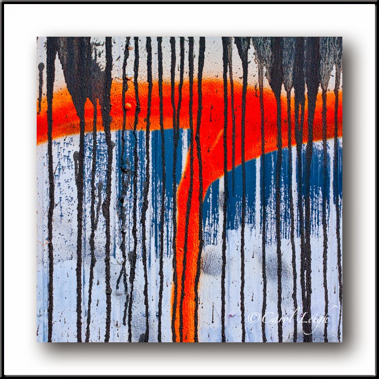
(3) Graffiti on the side of a railroad car. I was initially attracted to the eye. Squint and you'll see it's actually Michael Jackson.
(4) A faux postcard I made using my photos of old stamps, ink on vintage paper, faux labels, numbers from old banknotes, and who knows what else.
(5) A photomontage I made with my photos of texture from an old fishing boat, a monoprint I made using acrylic paint and rubber bands, hand-painted stripes, and more.
And finally (6) a blending of photos I took of a mural and paint streaks on the side of a building.
Maybe I do have a style after all: eclectic weirdness!
Saturday, August 2, 2014
Latest work: "Tenacity"

© Carol Leigh
Thursday, July 31, 2014
4th Floor

© Carol Leigh
Wednesday, July 30, 2014
Latest work: "Santa Fe Sunrise"

As is often the case when I play around with my photos, this was a surprise, nothing I had planned. A pleasant surprise.
May your week be filled with pleasant surprises!
©Carol Leigh
Monday, July 28, 2014
Status of 50-collage project . . .


Some time ago I decided to create 50 collages, all on the same substrate, all the same size. The goal was to help me loosen up a bit and to become more familiar with the process.
Well, I'm halfway through. What have I learned? Glue is sticky. Pre-cut square cards aren't always perfectly square. And that when I think I've placed something just so, well, it isn't just so when I look at it five minutes later.
Yet I press on.
These are three that I made in the past couple weeks, all using papers that my midwestern collage expert/friend sent me as a gift. I'm particularly drawn to the first one, which is a map of Rome that I tore up and then added things to. Love the Italian postage stamp I had in my own stash.
The second image I like because of its monochromatic look, but then there's the surprise of the red thingies in the middle.
And finally, my friend sent me some especially bright colors (which I usually don't use), which encouraged me to use this graphic of a fish that was printed onto rice paper. I added the bubbles, added painted dots to some of them, then called it done.
All of these collages are the same size, created on paper that's 4.75 inches square. Quite small, actually.
And what, you might ask, am I going to do with these once I'm done? Ha! I have no idea. Some of them I'm scanning and sending them up to Fine Art America. Have any of them sold yet? Well, no. But then you never know.
And speaking of Fine Art America, already this year I've sold more photos and earned more income than all of last year. Very grateful for what's happening over there.
Wishing you all a creative week, with sunshine, cool breezes, and no mosquitoes.
©Carol Leigh
Friday, July 25, 2014
Quick way to intensify color in Photoshop

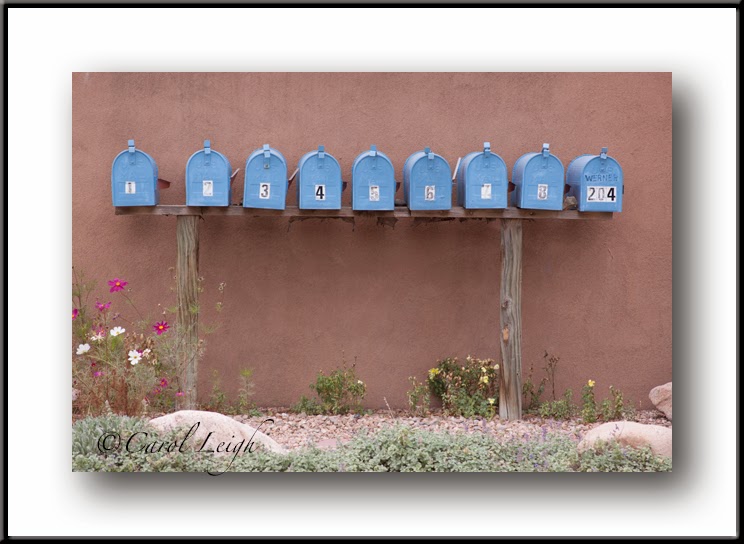
Let's say you took a photo and it looks really blah. There are a lot of ways to make your photo pop, but here's a really fast and easy way to do it.
In Photoshop, make a duplicate layer of your photograph. With the duplicate layer active and on top, change the blending mode to "Multiply." That's it!
Here, let me show you an example. I took a photo of a row of blue mailboxes in Santa Fe. As you can see in the original untouched photo, the photo has no depth, no oomph, no drama. So I brought it into Photoshop, made a duplicate of the original. Then changed the blending mode to "Multiply."
I might have toned down the "Multiply" effect a little bit by using the opacity slider, but that's it. Huge difference, no?
©Carol Leigh
Thursday, July 24, 2014
Summertime blues . . .


When I prep photos for other purposes, I'll often convert some of them to this format, copy them to a "blog" album, and then, like this morning, will rummage through those pictures, seeing if I can find some sort of a theme.
That's what I did this morning when I noticed these three, which all have similar blue colors to them.
I'm particularly partial to the top image, taken in Tucson, Arizona. I like how the picture is divided into three vertical sections. I like how the railing really stands out. And I like the hint of a cement step there at the bottom.
The shot of the pear is, frankly, weird. I don't remember now, without going back to the original PSD file, how I created this, but for some reason the starkness and spareness appeals to me. I also like the hint of orangey-brown, a complementary spot of color with the blue outline of the pear.
And then the last photo, I dunno . . . It's a very abstract image of reflections of a fishing boat in the water on an overcast day. What I like is the silvery look of the water (shades of grey, white, and peachy-beige) along with the blue of the boat.
Also, not that you care, you can tell which photos I prepped using the Mac versus the ones I prepped using the PC by looking at the signature. Photo #3 was done on the PC while the top two were done on the Mac. (My font from the PC is not available on a Mac. So much for creating a standard look!)
Too bad today's not Monday . . . I could have had "Summertime Blues" and "Blue Monday" at the same time . . .
©Carol Leigh
Sunday, July 20, 2014
Colorful morning . . .


Lovely morning yesterday, beginning with a car show at 8 and from there, down the hill to the fishing boats. Weather was painfully sunny, so bright, so glaring, so tough to deal with, but wonderful just the same. Photography was a challenge, but I'm pleased with these two, the screaming colors of a 1948 Ford panel truck and the hull of a blue fishing boat reflected in calm water.
Right now my online class students are working on an assignment called "Extreme Colors," so I had them in mind as I was doing my shooting. The car's definitely extreme; the boat a little less so, but colorful nevertheless. A very good morning.
©Carol Leigh
Friday, July 18, 2014
Blending Modes and Format


When I create my photomontages, I invariably place one image over another and then run through the blending modes. What I'm looking for are those happy surprises, where colors change, certain elements go from light to dark and vice-versa, and maybe the entire feeling of the piece changes. Happy surprises make my day, and that's what happened here.
This image is a combination of three abstract bits of a wall. Using one blending mode, I get the turquoise version. Using a different blending mode, I get the darker blue version. I like both of them equally.
But then, once I've finished making whatever it is I've made, I often check to see how it looks as a square. Sometimes I like the square better, sometimes I prefer the full format. In this case, I show you what the square format looks like compared to the full format. And, once again, I like both of them equally.
What's my point? When making photomontages such as these it pays to experiment, and running through the blending modes, all of them, is a simple way to surprise yourself. And then, what the heck, crop your image into a square format and see how you like it. If it looks great, then bonus! You've surprised yourself twice! A great way to begin your day.
©Carol Leigh
Monday, July 14, 2014
"Summer School" online photo class begins Friday . . .


"SUMMER SCHOOL" ONLINE PHOTO CLASS 2014
Four fun, easy (yet challenging) lessons designed to get you out there looking, composing, and creating.
The class runs for six weeks (July 18-August 25, 2014), features four lessons/assignments, and substantial critiques of your work.
You have two weeks to complete each assignment. Submit up to three images for each assignment and receive a critique of each one from me as well as comments from your fellow students.
You'll find this "summer school" online class refreshing, fun, informative, and challenging. Any camera will work: cellphone, iPad, DSLR, etc.
Here are the names of each lesson/assignment:
EXTREME COLORS
TWOS AND THREES
CAR ART
FACES IN UNLIKELY PLACES
TWOS AND THREES
CAR ART
FACES IN UNLIKELY PLACES
The registration fee is $85. You can sign up at my online store here:
Need more information? Contact me at carol AT carolleigh DOT net
Want to talk to me live and in person? (541) 563-3834.
Sunday, July 13, 2014
Latest work: "Moondance"

I've been reading about the big full moons expected this summer.
Because we live on the Oregon coast, seeing a full moon is a rarity as
clouds, fog, and rain usually obscure the view. So yesterday I made my own. And
gave her some friends.
To make this image I used photos of painted papers, calligraphy, Japanese rice paper, ink, and acrylic paint. © Carol Leigh
To make this image I used photos of painted papers, calligraphy, Japanese rice paper, ink, and acrylic paint. © Carol Leigh
Thursday, July 10, 2014
Orchidaceae

Why? Because I can . . .
©Carol Leigh
Subscribe to:
Posts (Atom)