A few weeks ago we were walking around Seattle and came upon a shop filled with bizarre, arcane, and incredibly interesting things.
The shop was closed.
But a skeleton was near the front window, so I pressed my camera up against the glass and photographed him.
I particularly like the pin holding the jawbone intact as well as the hook and eye that allows the top part of the skull to open and then stay securely closed.
I mean, we just don't find things like this at the local Wal-Mart!
Wishing you a Happy Halloween, no matter where you find it.
©Carol Leigh
All text, photographs, and other media are ©Copyright
Carol Leigh (or others when indicated) and are not in the public domain
and may not be used on websites, blogs, or in other media without
advance permission from Carol Leigh.
Monday, October 31, 2016
Sunday, October 30, 2016
Building boats


Yes, still building boats. There's a final project in mind, but I'm still not sure about it, so these little boat-lets keep me going on it.
Aren't they cute?
All together now: "Yes, Carol, very cute!"
©Carol Leigh
All text, photographs, and other media are ©Copyright Carol Leigh (or others when indicated) and are not in the public domain and may not be used on websites, blogs, or in other media without advance permission from Carol Leigh.
Saturday, October 29, 2016
Fun in a cemetery.
What I find particularly cool about this image is that I made it in a cemetery yesterday! Perfect!
It was a gorgeous day and so we visited a number of places on the island. Sunnyside Cemetery overlooking Ebey's Prairie was stop #1.
And there was one grave that immediately caught our attention.
Apparently a dear departed dad had a fondness for Halloween, and his family/friends decked out the gravesite in fine fashion for him, with lots of bones, skulls, skeletons, bats, ghosts, and creepy figures such as this guy.
Solar-powered skull lights lined the grave, and a motion sensor caused creepy folks hanging from trees to suddenly shake and turn this way and that. And then they stop.
But when you lean in close with your iPhone to get a close-up of the creature's face, the creature unexpectedly comes alive again, which startled the heck out of me. And startled subsequent visitors, much to my amusement.
Now whether Dad truly did love Halloween is total speculation on my part. But somebody did/does, and the result is a surreal note of life and hilarity in an otherwise somber setting.
It was weird, it was fun, and it resulted in this photograph, which I never in a million years would have expected to make.
Happy Halloween! Got candy?
©Carol Leigh
All text, photographs, and other media are ©Copyright Carol Leigh (or others when indicated) and are not in the public domain and may not be used on websites, blogs, or in other media without advance permission from Carol Leigh.
Labels:
candy,
Carol Leigh,
Ebey's Prairie,
Halloween,
Sunnyside Cemetery
Wednesday, October 26, 2016
What I saw, what I made, what I sold

I sold a large print (48"x32") the other day to a buyer in Canada. And the subject matter was strange. So was the composition. And even though I truly love the image, I was rather surprised that it sold.
Here you see a photograph of the entire sign. That’s not the one that sold.
Below it is a photograph of part of the sign. And this is the composition the buyer chose.
Are you interested in the thought process? Well, as I was driving along I saw an old run-down, abandoned motel. But the coolest part (for me) was the sign, rising high in the sky. So that’s what I concentrated on.
But why did I make the image I did? The one that the buyer chose? Because I “collect” photographs of arrows. Whenever I’m out and about, I’m attuned to arrows in one form or another. You can find them in graffiti, on signs, on billboards, sides of buildings, on doors, ships, and airplanes.
And because I’m subconsciously always aware of arrows, they encourage me to create some often quite weird compositions. And that’s what this is. I couldn’t isolate the arrows by themselves very easily, but I could isolate one, sort of. The bottom parts of the letters “E” and “L” echo the shape of the arrow and everything just sort of goes together.
A bonus, too, is that I always notice the color red. So for me, combining the bold white shapes of the arrow and the letters, on a brilliant red background, was sheer joy.
But it all probably would not have happened if I didn’t have a predilection for arrows. And this one became just one more in my quiver.
©Carol Leigh
All text, photographs, and other media are ©Copyright Carol Leigh (or others when indicated) and are not in the public domain and may not be used on websites, blogs, or in other media without advance permission from Carol Leigh.
Monday, October 24, 2016
Recent work: "Architectural Reflections"


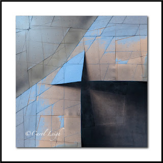
Had fun photographing in Seattle a couple weeks ago and created a 10-image series of shots taken at the EMP building, a building designed by Frank Gehry, who also designed the Disney Concert Hall in downtown Los Angeles. Here are three I particularly like, especially the origami-esque look they have.
©Carol Leigh
All text, photographs, and other media are ©Copyright Carol Leigh (or others when indicated) and are not in the public domain and may not be used on websites, blogs, or in other media without advance permission from Carol Leigh.
Labels:
"Architectural Reflections",
Carol Leigh,
EMP,
Gehry,
latest work,
recent work,
Seattle,
Washington
Saturday, October 22, 2016
Building boats


Yup, the daily collage boat project continues. It's fun, easy, photos taken with the iPhone, a little tweaking, and done!
I have so many now, but I know you don't want to see them all. So here are three for this week.
©Carol Leigh
All text, photographs, and other media are ©Copyright Carol Leigh (or others when indicated) and are not in the public domain and may not be used on websites, blogs, or in other media without advance permission from Carol Leigh.
Friday, October 21, 2016
What's it made of?


A lot of people ask me, when I make a photomontage, what's in it? Where do you get the stuff and how do you use it?
Well, this morning I was poking around in my "Astoria, Oregon" photos, not looking for anything in particular, and saw a big "S" that was painted on a wooden sign.
It's a good-looking "S," and you can see the original in the second photo.
I didn't like the monochromatic look, so, still in the "Astoria" files, I saw a photo I'd taken of a cement wall that had been painted red, and the paint was beginning to chip and peel. (See the third photo.)
The wall gave me the texture and the grunge and the color that I needed. But I wanted something more.
Still in that "Astoria" file, I found a photo I'd taken of a piece of metal that had holes punched in it. So I used a part of that to create a "base" of sorts to the "S." See the white space below the "S" in the second shot? Too plain and boring. Hence the weird metal.
Look at the very top of the first photo and you can see where I added a bit of the metal up there as well.
And there you have it. An "S" with good bones, tricked out a bit with color and texture. And it's RED! Good way to start the day. (If you're weird, that is!)
©Carol Leigh
All text, photographs, and other media are ©Copyright Carol Leigh (or others when indicated) and are not in the public domain and may not be used on websites, blogs, or in other media without advance permission from Carol Leigh.
Labels:
"S",
alphabet,
alphanumeric,
Carol Leigh,
letter,
photomontage,
red
Thursday, October 20, 2016
Journal bits . . .
Rummaging through old photos and found this. Struck me funny when I made it. Struck me funny today!
©Carol Leigh
All text, photographs, and other media are ©Copyright Carol Leigh (or others when indicated) and are not in the public domain and may not be used on websites, blogs, or in other media without advance permission from Carol Leigh.
©Carol Leigh
All text, photographs, and other media are ©Copyright Carol Leigh (or others when indicated) and are not in the public domain and may not be used on websites, blogs, or in other media without advance permission from Carol Leigh.
Tuesday, October 18, 2016
Yellow boat
This pretty yellow boat was side-tied to a dock in Nova Scotia and proved to be rather difficult to shoot.
All my angles just didn't work and when they did work, my lens wasn't quite wide enough. Exasperated, but determined, I filled my frame with 2/3 boat and 1/3 water.
I didn't like the shot at first, but the more I look at it, the more it appeals to me. Why?
Well, the color's good. It's a solid yellow that's striking.
And then there's the strip of green all around the edge, which sets the boat apart from the water and also adds a touch of interest.
The dark water, too, helps set off the light, bright color of the boat.
And then what really appeals to me is the composition, how I opted for a vertical format, have the pointy end pointing up, how at first glance the photo appears to be simply of a bold shape, and then you see that it's a boat.
The composition is clean, simple, strong. Just like the Nova Scotia boat.
©Carol Leigh
All text, photographs, and other media are ©Copyright Carol Leigh (or others when indicated) and are not in the public domain and may not be used on websites, blogs, or in other media without advance permission from Carol Leigh.
Sunday, October 16, 2016
Buoys and boathouses . . .


A few overviews of what we stumbled upon wandering around Peggy's Cove, Nova Scotia on a sunny morning.
©Carol Leigh
All text, photographs, and other media are ©Copyright Carol Leigh (or others when indicated) and are not in the public domain and may not be used on websites, blogs, or in other media without advance permission from Carol Leigh.
Saturday, October 15, 2016
Boatyard art

I'm finding lots of cool grunge these days in boatyards, including this section of a wall as well as a cracked glass something or other amid peeling paint.
Weather update: Doesn't look as though the storm lived up to its dire predictions. We've had steady, gentle rain, a little bit of wind here and there, but nothing like what we were warned might happen. By Saturday afternoon we'll know for sure.
Always good to be prepared. Even better to have dodged a meteorological bullet.
©Carol Leigh
All text, photographs, and other media are ©Copyright Carol Leigh (or others when indicated) and are not in the public domain and may not be used on websites, blogs, or in other media without advance permission from Carol Leigh.
Friday, October 14, 2016
Never say never . . .


In a previous post I said I probably wouldn't be using the Prisma cellphone app again, but nope, I succumbed during our recent trip to Seattle.
It's just too much fun, too cool, and for the moment I don't have an alternative.
We had a room with a view. One heck of a view. And so in the first photo you see Pike Market and a ferry heading out.
It rained that evening, and so I photographed raindrops on the window with the lights of the market across the street. I LOVE that shot and what the Prisma app could do with it.
And then a quick shot of a couple at the next table in a restaurant for breakfast.
Quick shots, fun creativity with a very cool app.
Weather update: Steady rain, brief spate of wind around 2 a.m. So far, so good!
©Carol Leigh
All text, photographs, and other media are ©Copyright Carol Leigh (or others when indicated) and are not in the public domain and may not be used on websites, blogs, or in other media without advance permission from Carol Leigh.
Recent work: "Meridian Map"
Walking around a boatyard, I saw a huge refrigeration container and the
door was open. It was the silvery industrial look of the inside of the
door that caught my eye. Lots of scratches and bolts and things — all a
silvery grey color. So I combined that photograph with a photo I’d taken
of a cement wall, which is where you see the rusty metal strip at the
bottom and the crack running diagonally across the picture. I added some
hand-drawn lines, a few other things, and voila! A pseudo treasure map!
A red “X” marks the spot.
A very large storm is headed our way, and we may be in the midst of a power outage by the time this gets auto-posted. Luckily we have a generator, a chainsaw, and a lot of canned soup! I understand the storm is going to hit Oregon and far northern California as well, so we wish everybody down there good luck. This is going to be a scary one, methinks.
©Carol Leigh
All text, photographs, and other media are ©Copyright Carol Leigh (or others when indicated) and are not in the public domain and may not be used on websites, blogs, or in other media without advance permission from Carol Leigh.
Labels:
"Meridian Map",
Carol Leigh,
latest work,
photomontage,
recent work
Wednesday, October 12, 2016
Fisherman's Terminal


Well, here's a novel concept: actually showing you an overview of what a place looks like!
I realize my photos are so tightly cropped and designed that I give no clues regarding the surroundings. Thus, even though I consider the first shot here a sort of crappy image, I understand its importance to some viewers.
Ooh, but I love the next one! The stark simplicity of the weathered ladder against bold color and texture. And I like all the straight lines.
In the third photograph, I liked how the ship's bell stood out against the grungy windows and metal of the boat's wheelhouse.
And finally, two shots of fenders, or buoys, which keep one boat from bumping into another. The blue one looked so cool against the blue background, and the strip of red at the bottom (to me) is important because it serves as a sort of anchor or grounding to the picture.
And then I noticed how two fenders reflected their colors against the deep, dark blue of the ship's hull.
These are all subjects I find extreeeeeeemly exciting when I go out to shoot, much to Chris's amusement. He's getting better, though, as an enabler, generously pointing out something I might have missed, a grungy dirty something that he knows I'd just love.
All this was such a great beginning to our Seattle trip.
©Carol Leigh
All text, photographs, and other media are ©Copyright Carol Leigh (or others when indicated) and are not in the public domain and may not be used on websites, blogs, or in other media without advance permission from Carol Leigh.
Labels:
buoys,
Carol Leigh,
Fisherman's Terminal,
fishing boats,
Seattle
Different state, same theme . . .


Now back from a few days in Seattle, celebrating our 25th wedding anniversary, and what a wonderful time we had.
First stop was at the Fisherman's Terminal to check out the boats.
Major adrenaline rush.
I've never seen such a huge facility with extremely serious fishing boats. All shapes, sizes, types. Some beautifully kept up, others beautifully grungy.
Skies were overcast, very few people around, and the colors glowed and gleamed.
I'm overwhelmed at the moment with photos to process, but these are a few that initially caught my eye.
We walked more than four miles and still didn't see everything.
Nets, floats, bumpers, buoys -- did I not get enough of this while living in Oregon? Apparently no.
©Carol Leigh
All text, photographs, and other media are ©Copyright Carol Leigh (or others when indicated) and are not in the public domain and may not be used on websites, blogs, or in other media without advance permission from Carol Leigh.
Labels:
buoys,
Carol Leigh,
Fisherman's Terminal,
fishnets,
Seattle
Saturday, October 8, 2016
Cool painterly app from Prisma and . . .
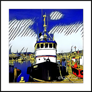
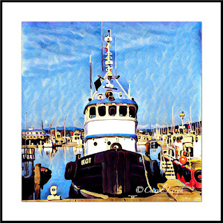
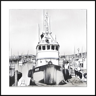
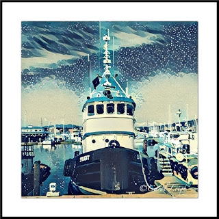
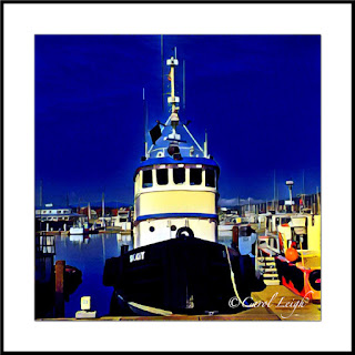
Cool painterly app from Prisma and . . . why I’m not going to use it any more.
Prisma is an app that you can download and use to change your photographs into cool, colorful, painterly images. It’s fun. It’s easy. It’s addicting.
Here’s a photo of a tugboat I took last year using my iPhone. This morning I applied 18 different painterly effects to it and then selected five that I particularly like so you can see what it does.
The first photo you see is the original shot.
Prisma is free and available for both IOS and Android phones. Here’s where you can get more information: http://prisma-ai.com/http://prisma-ai.com/
I didn’t write down the name of each effect because the names seem to be changing as the company grows, and who knows if that effect will still be available if and when you go to play with it. In addition, the effect works differently based on whatever photograph you’re starting from.
The effects range from painterly to sketch-like to comic strip-ish. You could spend hours playing around, using different photos and then applying all the different effects to see how they look. The results are fun and cool, as you can see. Note that the app works only with square images.
Here’s my little problem. You have to be connected to the Internet to use it. It’s not a stand-alone app. And if too many people are using it at the same time, you get a message saying to try again later. Grrrrr. I want instant gratification. And I want it NOW!
In addition, every time you apply an effect to an image, the terms of service indicate that you agree that the server you’re uploading to, which is located in Russia, has the right to do whatever they wish with your picture.
For me, a person who lives in the boonies and has very limited Internet access, that constant uploading/downloading is a problem. And the terms of service make me uncomfortable.
Prisma alternative . . .
Is there an alternative to Prisma? Something you can download and then use as much as you want in your computer without having your image uploaded every time? Yes. The company is called Painnt, and it seems to have a lot of the same effects as Prisma, with the benefit that you don’t have to upload your photo to see what the effect does.
Painnt charges for their app, You can find out more about it at their Facebook page here: https://www.facebook.com/PainntApp/
Have I played with Painnt yet? No. I’ve spent way too much time so far with Prisma at the moment! I probably will try out Painnt in the next few weeks. And if any of you have already played with it, I’d love to hear how you like it.
In the meantime, Chris has apparently planned a surprise few days for us in Seattle to (belatedly) celebrate our anniversary. All I know is that we’re going to Seattle. Where we’ll stay and what we’ll see is the surprise. Will let you know when we get back.
©Carol Leigh
All text, photographs, and other media are ©Copyright Carol Leigh (or others when indicated) and are not in the public domain and may not be used on websites, blogs, or in other media without advance permission from Carol Leigh.
Friday, October 7, 2016
Same letter, different looks


Three pictures of the same letter "Y." They're so old that I don't remember exactly what went into each one, but the "Y" I do remember -- it's from the 73-foot fishing vessel "Kylie Lynn" in Newport, Oregon.
What's fun about creating photomontages like these is that they change depending on what images you blend together, and what blending modes you use.
The common denominator here is the letter "Y."
In the first image, I combined it with a photo of scratches on a fishing boat. The original blue color of the "Kylie Lynn" remains the same.
In the second image, I used photos of rivets I'd taken of the bridge in Waldport, Oregon. The background is a picture of some paint splotches on asphalt in a parking lot.
The components in the red image are the same as the green. Same rivets, same sort of squarish form upper right, the circle at the right-hand middle edge.
And then I added some thin lines running horizontally in the lower third. Why the lines? I do not know. Seemed like a good idea at the time.
So there you have it. Same letter Y, different components, different blending modes.
©Carol Leigh
All text, photographs, and other media are ©Copyright Carol Leigh (or others when indicated) and are not in the public domain and may not be used on websites, blogs, or in other media without advance permission from Carol Leigh.
Wednesday, October 5, 2016
Beginning of fall . . .


Back in a previous life, I led photo workshops in the eastern Sierra. I conducted them on weekends so that people who worked full-time might have a better chance to attend.
It got too crowded on weekends, so I switched to mid-week.
But then it got too crowded on weekdays, so I stopped altogether.
There were easily 20+ workshops every week being held in and around Bishop, California. I saw one with maybe 30 participants at the beaver ponds.
Can you imagine?
Leaders with walkie-talkies hanging off vehicles as they zoomed up and down narrow, narrow dirt roads.
And if there was a full moon at Mono Lake at the same time? Fuhgeddaboudit.
But this same time each year I find I miss it. A lot.
Not only the color spectacle, but the camaraderie, the joy of bumping into someone on the trail I knew, or who knew me, or who used my little guides to find some good spots. And who thanked me for showing them something that maybe they wouldn't have seen otherwise.
I'm a gregarious recluse. I need my alone-time, but I also love being out there among 'em.
So this morning I took a look at a few photos I shot one fall on the other side of the hill from Lake Tahoe.
And I fondly recall the cool crisp air of the eastern Sierra, the glorious aspens, the boulders that look blue if you photograph them in the shade, and the complementary yellow/orange leaves and buckwheat that offer a lovely warmth.
And I remember one of my workshop attendees, when I said, "Give me a few minutes to get my act together." And he said, "Uh, Carol, you're gonna need more time..."
Or another one who said, "Carol, why can't you offer these fall foliage workshops in the summer, when it's warmer?"
See? That's the kind of thing I miss!
©Carol Leigh
All text, photographs, and other media are ©Copyright Carol Leigh (or others when indicated) and are not in the public domain and may not be used on websites, blogs, or in other media without advance permission from Carol Leigh.
Subscribe to:
Comments (Atom)


