Saturday, December 24, 2016

A word for the upcoming year?

A word for the upcoming year? Many are giving it thought.

My friend, Laura Lein-Svencner, has decided on NATURAL, a word that, for lots of reasons, resonates with her, has meaning for her, and will be something that’s always in the back of her mind.

So I wondered, should I have a word? A meaningful concept always floating around in my brain, consciously, or sub-?

This past year has been a challenge. I’ve always been apolitical, far removed from the fray. But this year? It’s been hard to ignore, hasn’t it? Never has politics been so repugnant, repellent, repulsive than what we saw in 2016, no matter which side you were on.

Name-calling, misogyny, bigotry, pettiness — all shoved in our faces, every minute of every day.

Where was decency, empathy, kindness, and objectivity?

It all came to a head this past week when a crony of the president-elect said the most despicable and hateful things about the outgoing president and his wife.

It made me cry in despair. And it made the word I’d chosen for 2016 come into sharp focus:

RISE

The word RISE is nothing but positive. An “upward movement.” To ascend. To go up. To do a better job.

Hot air balloons rise upward. “A rising tide floats all boats.” Rise from the ashes. Rise above expectations. Rise to the challenge. Rise to the occasion. Boost. Prosper.

Get up, stand up. The sun also rises. Sunrise. SurpRISE!

So that’s my word for 2017. RISE. Rise above the bigotry, meanness, hate, pettiness, aggression, the ordinary, the stupidity, the average. “We rise by lifting others.”

It’s a short, monosyllabic word — RISE. How hard could it be to put into practice? We shall see. In 2017, we shall see.

Wishing you all the best of everything in 2017.

Carol Leigh
Chris Smith
Abby the Psycho Cat

Wednesday, December 21, 2016

Winter Solstice

Wishing us all peace, tranquility, and kindness this season.

©Carol Leigh
All text, photographs, and other media are ©Copyright Carol Leigh (or others when indicated) and are not in the public domain and may not be used on websites, blogs, or in other media without advance permission from Carol Leigh.

Monday, December 19, 2016

Snow days!


We had snow on Whidbey this past weekend and were trapped at home. Even though it wasn't much (relatively speaking), it was the terrain that did us in.

Our driveway is kind of steep, and with a bit of snow on it, should the car begin to slip, slowly descending the driveway could easily turn into Mr. Toad's Wild Ride down into the street.

Once on the street, one encounters the "dip." And the dip is a significant one. I've heard about one of our neighbors who puts on chains at the top of the dip and then removes them once she gets to the other side!

So we cancelled the party we had scheduled for Saturday and just hunkered down and enjoyed the show.

The top photo is our back yard as seen from the living room windows. So pretty.

And the second photo was taken from the front porch. Equally pretty.

We put out lots of birdseed, which attracted juncos, varied thrushes, towhees, kinglets, and a hawk. Who was attracted to the birds. We could tell when the hawk was near -- not one little bird to be seen.

Snow. A novel experience for us. And absolutely lovely, don't you think?

 ©Carol Leigh
All text, photographs, and other media are ©Copyright Carol Leigh (or others when indicated) and are not in the public domain and may not be used on websites, blogs, or in other media without advance permission from Carol Leigh.


Sunday, December 18, 2016

Eight years apart . . .


The top photo is an image I took in 2008, using a Canon EOS 20D camera. And I processed the image as I usually did back then.

Looking at it today, eight years later, I find it rather dull. But what I like about it is the strong vertical slightly curved line and how it meets the highly curved line bottom right.

I also like the way the vents create a series of horizontal repeating lines. Horizontal lines that move your eye from top to bottom, echoing the strong vertical line on the right.

It's a combination of soft curves and straight lines. I like the texture and I like the color.

I found it in a directory I'd labeled "monochromes."

I opened the file yesterday morning and wondered what I might do to it now, eight years later.

Using Adobe Camera Raw, I lightened and brightened the image. I also increased the contrast, and, using the clarity slider, enhanced the sharpness.

Not content with that, I looked in a directory I have of metal texture photos. I selected a picture I'd taken of scratched metal, desaturated it to remove the greenish cast it had, and then added that picture to the mix.

Is the bottom photo better than the top? Eight years later, have I learned anything? I'm not sure.

The bottom image is lighter, brighter, more vibrant, has more contrast, more life.

But notice this: You see a stronger sense of line and design and composition in the top photo. Why? Because it doesn't have the color "distractions" that you see in the bottom shot.

So I'm going to go with the second photograph. Overall it's more appealing (to me). But I do like how the design pops out in the first.

What's my point? I don't really have one, other than to say it's fun to revisit old photographs with new eyes and new skills. That this learning process never ends, and how lucky we are that it doesn't?!

©Carol Leigh
All text, photographs, and other media are ©Copyright Carol Leigh (or others when indicated) and are not in the public domain and may not be used on websites, blogs, or in other media without advance permission from Carol Leigh.


Saturday, December 17, 2016

Latest work: "Bits and Pieces"

A potpourri of small vintage Japanese papers gathered together to make a larger piece. I like the elongated look, and have a few more in progress.

©Carol Leigh
All text, photographs, and other media are ©Copyright Carol Leigh (or others when indicated) and are not in the public domain and may not be used on websites, blogs, or in other media without advance permission from Carol Leigh.

Friday, December 16, 2016

Experiment #9269

©Carol Leigh
All text, photographs, and other media are ©Copyright Carol Leigh (or others when indicated) and are not in the public domain and may not be used on websites, blogs, or in other media without advance permission from Carol Leigh.


Tuesday, December 13, 2016

Latest work: "Painter's Tape"

At least it looks like painter's tape to me!

©Carol Leigh
All text, photographs, and other media are ©Copyright Carol Leigh (or others when indicated) and are not in the public domain and may not be used on websites, blogs, or in other media without advance permission from Carol Leigh.

Monday, December 12, 2016

A couple of boats . . .


A couple of boats in the Nova Scotia fog. Lovely.

©Carol Leigh
All text, photographs, and other media are ©Copyright Carol Leigh (or others when indicated) and are not in the public domain and may not be used on websites, blogs, or in other media without advance permission from Carol Leigh.

Friday, December 9, 2016

What's It Made Of?


The other day I was rummaging through my photographs and ended up creating this.

Frankly, I don't know what I'll ever do with this picture (other than use it as a teaching tool), but it was fun to make, and here's what I used:

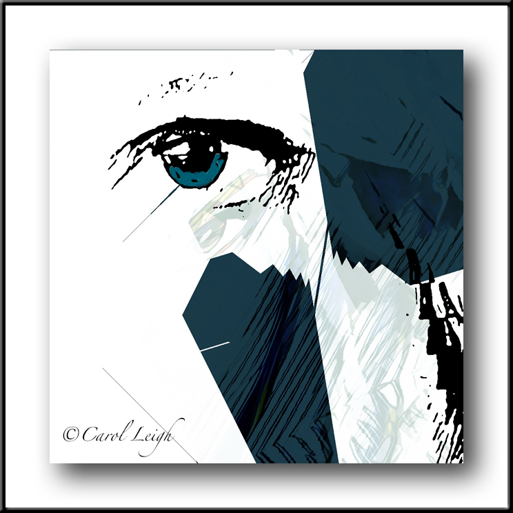
There are two versions of the picture -- the original vertical format and then the squarified version. Why? Because each version gives you a different feel.

In the top image, there's both vertical and horizontal movement. There's a horizontal line up top, which echoes the horizontal line of the "4665" at the bottom.

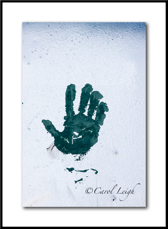
Then there's the hand, which sort of links, in a vertical fashion, those two horizontal elements.

The square version does not emphasize movement. Your eye goes plonk, right to the hand/number combo. It looks around a little bit, but always sees the numbers and the hand. Not nearly as much movement as the first picture, but rather immediate impact.

There are basically just three pictures I used to make this. And I found them all in a boatyard.

First, there's the background, which is a photo I took of the side of a boat that was being refurbished, so you're seeing scraped and sanded paint, dirt, grunge, grime, and a number of dusty, faded colors.

I LOVE PHOTOGRAPHING THIS SORT OF THING!

Then there's the hand. I think it's really a painted glove that someone slapped on a wall.

And then there are the numbers, which caught my eye because they're pulling away from whatever they're stuck on, which gives them a certain depth and texture. Didn't need all the numbers; four worked fine.

And that's about it. I've shown you the sorts of things I take photos of, and then how I've combined them into one semi-weird photo that darned if I know what I'll do with.

Except show it to you here.

©Carol Leigh
All text, photographs, and other media are ©Copyright Carol Leigh (or others when indicated) and are not in the public domain and may not be used on websites, blogs, or in other media without advance permission from Carol Leigh.

Thursday, December 8, 2016

Experiment #9924

©Carol Leigh
All text, photographs, and other media are ©Copyright Carol Leigh (or others when indicated) and are not in the public domain and may not be used on websites, blogs, or in other media without advance permission from Carol Leigh.

Wednesday, December 7, 2016

Lather. Rinse. Repeat.

As I meandered around a boatyard last month, I found this little creature apparently shampooing. He's actually just some peeling paint and weathered metal, but his cute face really stood out.

I was shooting with a macro lens, so it was easy to move in closely. Much to his dismay, I'm sure!

©Carol Leigh
All text, photographs, and other media are ©Copyright Carol Leigh (or others when indicated) and are not in the public domain and may not be used on websites, blogs, or in other media without advance permission from Carol Leigh.

Tuesday, December 6, 2016

Experiment #9375

I am loving these weird creations I'm making.

But there's a problem, and you may know the answer.

I have a lot of images in my iPhone 6+ that I want to download into my Mac Mini. I usually do this via a WiFi connection and software called, I believe, Photo Transfer.

This requires a fair amount of data being transferred out of my phone and then into my computer. I'm sensitive to data these days (ad nauseum), and to send and then receive more than a gigabyte of data impacts my limited data plan.

Is there a way to physically download/upload my cellphone photos without using WiFi? Maybe even from the cellphone to a flash drive, and then from the flash drive into the desktop computer? That way I could use the WiFi at the library or a local restaurant, then bring the flash drive home to do the rest.

Any suggestions would be most welcome!

NOTE: I figured it out (thanks to Chris). Adobe Bridge has an import feature. All I do is plug my camera's USB into the Mac Mini. Open Bridge. Import photos from my phone. Easy. It was Chris who suggested using the USB cable. I found the rest (after struggling with iPhoto for way too long -- do NOT like that application and just wanted to get my photos OUT of there). I don't use iPhoto at all, considering it a snare and a delusion. End of min-rant. All is well photo-wise. And it's 31 degrees at the moment. Winter has arrived.

©Carol Leigh
All text, photographs, and other media are ©Copyright Carol Leigh (or others when indicated) and are not in the public domain and may not be used on websites, blogs, or in other media without advance permission from Carol Leigh.

Friday, December 2, 2016

Sgraffito

For this photomontage I combined photographs of Japanese lettering, a painted piece of paper where I’d scraped the paint away, and part of a "cigar store Indian" statue. The warm colors appeal to me, as do the scratches, scrapes, and bits of red.

©Carol Leigh
All text, photographs, and other media are ©Copyright Carol Leigh (or others when indicated) and are not in the public domain and may not be used on websites, blogs, or in other media without advance permission from Carol Leigh.

Thursday, December 1, 2016

December is here . . . already

Everybody's gonna be saying it: "December already? This year's gone by so fast!"

So I won't say it.

The Winter Solstice is coming up. I was reading about it, what people do to celebrate it. And a lot of it has to do with contemplation, quiet, and simplicity.

The irony was that so many of the websites I visited to research Winter Solstice were packed with ads, encouraging me to simplify by purchasing books about simplification. Ads that blinked, changed colors, jiggled up and down, desperately wanting my attention so I would buy their products.

"Please, Carol, buy more so you can simplify your life!"

But what if I have no more room in my bookcases for yet another book? Well, then, there are links to Ikea, where I apparently have a huge selection of bookcases to choose from. Yes, maybe another bookcase will simplify my life!

But what if I have no space in my house for one more bookcase? Well, there are hundreds of DIY books all about home additions. Obviously I'll need some power tools. . .

Gotta love this Winter Solstice holiday. I'm going to relax, contemplate, and simplify. But first, I have some major shopping to do . . .

©Carol Leigh
All text, photographs, and other media are ©Copyright Carol Leigh (or others when indicated) and are not in the public domain and may not be used on websites, blogs, or in other media without advance permission from Carol Leigh.


Wednesday, November 30, 2016

Eight Years of November


I took a look at all the photos I've posted in the month of November over the past eight years and selected one from each November for each year. (What a confusing sentence. Darned if I'm going to edit it, though.)

In 2009 snow covered a still-blooming fuchsia bush as well as a cute little birdhouse in our back yard in Waldport, Oregon.

Another year I was out on the beach in Oregon, looking for patterns in the sand. That's one of the big things I miss here on Whidbey Island -- big empty beaches. Miles to walk, and if there were four people out there, it was crowded! There are lots of beaches here, too, but many are private, others are smaller. No huge expanses of sand during minus tides. Not a complaint! Just something I miss.

Below that is a photo taken at the Seal Rock overlook in Oregon. A long exposure helped emphasize water movement and the spray from the waves.

And the fishing boats in Newport, Oregon? I miss them, too, although I've found a few extremely cool places here in Washington to photograph. Just takes a bit more driving to get to them. The fishing vessel "Finn" looks pretty good there on a foggy morning.

Below "Finn" is a photomontage I made out of paper and copper and rusty metal that I call "Northern Lights."

The weird photomontage below that is called "And the Rains Came." I would have to go back to see all the elements I used to create it. But I do remember that the vertical "raindrops" came from a photograph I took of a carved and painted wooden support pole in Santa Fe. Gotta say, the results surprised me. In a good way.

The sepia-toned image is the Coupeville Wharf, taken in 2015 when we moved here to Whidbey Island.

And this year's November shot is called "Experiment #9504." An ongoing series that is simply fun at the moment.

So there you have it. November's been a pretty good month photographically over the years.

©Carol Leigh
All text, photographs, and other media are ©Copyright Carol Leigh (or others when indicated) and are not in the public domain and may not be used on websites, blogs, or in other media without advance permission from Carol Leigh.

Tuesday, November 29, 2016

Nautical bits

A gathering together of various nautical shapes, textures, bits and pieces.

©Carol Leigh
All text, photographs, and other media are ©Copyright Carol Leigh (or others when indicated) and are not in the public domain and may not be used on websites, blogs, or in other media without advance permission from Carol Leigh.

Monday, November 28, 2016

City graffiti


A couple of fun things found on walls in Seattle earlier this month.

©Carol Leigh
All text, photographs, and other media are ©Copyright Carol Leigh (or others when indicated) and are not in the public domain and may not be used on websites, blogs, or in other media without advance permission from Carol Leigh.

Sunday, November 27, 2016

Clean and simple

Rummaging around in old photographs, I came across this one that had been mis-filed. (Yeah, like my filing system is so fine-tuned!) And it took me aback.

It's a really good shot!

I wasn't taken aback because it was good; I was surprised I hadn't done anything with it. So I began working on it.

The dark blue fishing net behind the buoy really sets it off, and I like how the rope stands out. Even the little knot of rope at the bottom of the buoy is kind of cool.

Overall a clean, simple, pleasing little photograph. Patiently waiting over the years to be discovered.

And aren't we all?

©Carol Leigh
All text, photographs, and other media are ©Copyright Carol Leigh (or others when indicated) and are not in the public domain and may not be used on websites, blogs, or in other media without advance permission from Carol Leigh.

Saturday, November 26, 2016

Latest work: "Standing Ground"

This has a definite Native American vibe to it, which I really like. The wide center strip is a piece of corrugated cardboard I painted, and so is the smaller center strip.

A political message? Perhaps. A simple graphic, composition, line, design? Perhaps.

But really. Have we not done enough to these people?

©Carol Leigh
All text, photographs, and other media are ©Copyright Carol Leigh (or others when indicated) and are not in the public domain and may not be used on websites, blogs, or in other media without advance permission from Carol Leigh.

Thursday, November 24, 2016

Happy Thanksgiving!

Yup, my iPhone camera no longer focuses. Taking it in next week to have it looked at/replaced. In the meantime, feeling grateful today for friends, love, and the fact that I have a couple DSLRs to turn to!

Thankful, too, that I saw this graffiti on a train years ago that I could pull up and use in this space.

Happy Thanksgiving to all.

©Carol Leigh
All text, photographs, and other media are ©Copyright Carol Leigh (or others when indicated) and are not in the public domain and may not be used on websites, blogs, or in other media without advance permission from Carol Leigh.

Tuesday, November 22, 2016

Experiment #9132

©Carol Leigh
All text, photographs, and other media are ©Copyright Carol Leigh (or others when indicated) and are not in the public domain and may not be used on websites, blogs, or in other media without advance permission from Carol Leigh.

Monday, November 21, 2016

Giving thanks . . .

Here’s the big bonus to what I do. And fair warning: This is a long post.

Back in October I received a message via Fine Art America from a potential customer. She had praise and she had questions.

She wrote:

I love your work. Everything is so beautiful! I am thinking of buying Sunstorm no. 2. I am wondering whether you would advise that I choose canvas or acrylic. I am trying to decide between 24x24 or 30x30. Thank you for your time. And thank you for your beautiful art.

Now, who wouldn’t love to get a compliment like that?

So I went to see which image she was talking about. Here’s what I wrote back to her:

Good questions.

First of all, regarding size… I always read the “buyer reviews” that FAA posts. (There’s a link to them down at the very bottom left of their pages.) This way if there’s a problem with a particular product from FAA, I’ll know about it. I also see the buyer remarks in general about the buying process. One comment I see a lot is that customers often wish they’d bought the next size up. The pictures always look smaller when you receive them than you thought they’d be. So if you are wondering about 24x24 versus 30x30, I would suggest the larger of the two. And please know that I’m not trying to increase my profit here — I genuinely think that sizing up when buying online is generally a good recommendation.

However . . . You know the space you’re thinking about, not I. Would the larger version crowd things for you? If it were me, I’d tape together some pieces of paper to both the 24x24 size and the 30x30. Hold the taped-up paper on the wall where you’re thinking about hanging the picture and see what you think. The 30x30 might just be way too huge; the 24x24 absolutely perfect. I just know I’ve never read a buyer’s comment saying, “I wish I’d gotten a smaller version of the picture.”

Now, acrylic versus canvas. There’s a bit of sheen to the acrylic that, if the picture is facing bright light, might not let the color come through cleanly. And, frankly, the picture’s all about the color and simple design. If you opt for canvas, glare will be reduced, but the picture might appear to lose some of its crispness and vivid color. Soft landscapes, romantic scenes, etc. lend themselves to canvas. Sunstorm 2? Not so much.

Here’s another option: metal. The photographs that went into making this montage were all taken at a boat yard on the Oregon coast. The boats were metal. The colors are vivid, bright, bold. I’ve heard nothing but good reviews about the metal prints that FAA sends out, no complaints. And the next item I order from them for my house will be a metal print. They are sleek and really lend themselves to images such as Sunstorm. Anything that has a sort of industrial vibe, or super-bold colors looks amazing on metal. I believe the cost for metal is less, too, which makes the 30x30 size, if you wish it, more affordable. There’s the potential for glare, however.

Brief aside: I was recently in Nova Scotia and bought a framed print that was super-colorful. It’s behind glass. Had it shipped home. When I received it, we put it on a wall that faces a huge wall of windows. I was super-concerned about glare. But the only time we see the glare is if we are standing parallel to the picture; when we move a little to the right or left, the glare disappears. You might try putting a framed picture on the wall you’re thinking about to see how the glare reacts there. I just know I was surprised to see that glare wasn’t a problem at all, as long as I was at a slight angle.

I hope this answers your questions. It’s probably way too much info, in fact. But I do want you to be happy with your purchase.

Let me know if you have any more questions.


I put a lot of thought into my response to her. Maybe more than she needed. I wanted to make the sale, but I wanted to make the sale AND have her be happy with it. Win-win.

Nothing more until today. Here’s what she wrote:

I took your advice and purchased Sunstorm #2 at 30×30. I've attached a picture, although it's crooked but I'm no artist. I am a writer and professor and it cheers me immensely to be able to look at it as I work. Thank you for such a beautiful picture.

Now, how cool is that?! When someone tells you they like your work, is willing to pay you for it, and then takes the time to tell you how pleased they are, well, it doesn’t get much better than that, does it? Very thankful this holiday season to have received that feedback. Simple pleasures. May our lives be filled with them.

©Carol Leigh
All text, photographs, and other media are ©Copyright Carol Leigh (or others when indicated) and are not in the public domain and may not be used on websites, blogs, or in other media without advance permission from Carol Leigh.

The power of wonkiness


These letters look cool together. The top one, I believe, was on the side of a fishing boat, and the lower one was on the side of a shipping container in a salvage yard in Washington.

The rusting metal, the overall texture, and how they each have similar colors is what I find appealing. And their wonkiness gives them more energy, more life, than if they'd been perfectly level.

©Carol Leigh
All text, photographs, and other media are ©Copyright Carol Leigh (or others when indicated) and are not in the public domain and may not be used on websites, blogs, or in other media without advance permission from Carol Leigh.

Saturday, November 19, 2016

Experiment #9405

I'm not quite ready to talk about all the strange images I've been creating lately. I'm finding it so very exciting, but by talking about it, I fear I'll dilute the experience.

©Carol Leigh
All text, photographs, and other media are ©Copyright Carol Leigh (or others when indicated) and are not in the public domain and may not be used on websites, blogs, or in other media without advance permission from Carol Leigh.

Wednesday, November 16, 2016

Experiment #9039

©Carol Leigh
All text, photographs, and other media are ©Copyright Carol Leigh (or others when indicated) and are not in the public domain and may not be used on websites, blogs, or in other media without advance permission from Carol Leigh.

Tuesday, November 15, 2016

Experiment #9068

©Carol Leigh
All text, photographs, and other media are ©Copyright Carol Leigh (or others when indicated) and are not in the public domain and may not be used on websites, blogs, or in other media without advance permission from Carol Leigh.

Thursday, November 10, 2016

What I saw, what I made


I get this all the time. "What the heck are you shooting?" "Why did you take that picture?" "What are you gonna do with that?"

And I completely understand. Here's my thought process.

We were poking around a boatyard/dump/repair facility in Anacortes, Washington and I saw a weathered wall with grungy stuff running down it, with scrapes and scratches and bits of paint.

Adrenaline rush!

I knew there was something there that I could use later, but I didn't know why or what. I just knew it was important.

Click.

My first go-round with the elements in that top picture turned into this vivid blue and red picture that could easily have been an old metal sign, perhaps a graphic element on the side of a weathered fishing boat. To create it, I took my original photo and simply added more lines, some color, and part of something else that I don't remember now.

Colorful grunginess. That's why I like the second photo. It's almost an oxymoron.

I came across the top photo again another day and wondered what else I could do. I copied it, flipped it, put in a bit of color here and there, and added the two yellowish vertical elements on the left.

I felt the arrow had to be pointing toward something, so I added a photo I'd taken of some rivets in Oregon.

But then the bottom right seemed empty to me, so I added a photo of some lettering I shot on the side of a Willys Jeep on the Oregon coast. Done!

And now you know why I get up so early in the morning.

©Carol Leigh
All text, photographs, and other media are ©Copyright Carol Leigh (or others when indicated) and are not in the public domain and may not be used on websites, blogs, or in other media without advance permission from Carol Leigh.

Tuesday, November 8, 2016

Same scene, two cameras


Before Halloween we went over to Sherman's Farm in Coupeville to check out their pumpkins and to see families enjoying the trolley rides through the fields, the cows eating pumpkins (who knew?), and excited children running around all over the place.

Off to one side I saw this old wicker chair with pumpkins on it. I shot the top photograph using a DSLR and a 100mm lens. The scene was deeply shaded and I left a bit of the bluish color in the shot because I liked the mood.

Then I used my iPhone 6+ and took the second picture. I was able to move in much closer and sort of hover overhead to compose it.

That wasn't enough, however. I used a Prisma app to change the entire look, from a moody, shady image above, to this light, bright, more festive picture. I like both of them, but find myself more drawn to the iPhone shot, just because it's a bit more fun to look at.

Yes, it's not real. Yes, it's an app. But it's not PRETENDING to be anything else than what it is -- a tricked-out cellphone shot.

Happy election day. May this all be over soon.

©Carol Leigh
All text, photographs, and other media are ©Copyright Carol Leigh (or others when indicated) and are not in the public domain and may not be used on websites, blogs, or in other media without advance permission from Carol Leigh.

Thursday, November 3, 2016

Collage work . . .

I make a lot of envelopes. Not sure why, other than they're relatively small (this one's maybe 6"x6"), seemingly useful, and I create collages on them, turning them into little works of art. I also make collage postcards, which I will post here from time to time.

What I particularly like about these envelopes is how tactile they are. They're thick, yet soft. They've got lots of texture, lots of heft, and just feel old. I layer the papers both front and back and often the flap has more weight to it than the rest of the envelope. They're meant to be handled. If not fondled.

This is the front of one I made a few months ago. Old Japanese papers, torn bits of brown paper, and a little hint of red were all I needed.

©Carol Leigh
All text, photographs, and other media are ©Copyright Carol Leigh (or others when indicated) and are not in the public domain and may not be used on websites, blogs, or in other media without advance permission from Carol Leigh.

Wednesday, November 2, 2016

Then and now . . .


Rummaging around in old photos (2003!) I came across this image of a painted/rusted chain on a fishing boat in Oregon. I loved this subject matter then, love it now 13 years later.

The camera was my very first DSLR, a Canon EOS D60, which had, I believe, a 6mp sensor.

I was shooting JPEGs, knowing nothing about shooting RAW. Think I'd had the camera maybe two weeks.

But I did use Photoshop (sort of), and so did some post-processing, as you can see in the first photo.

Times have changed and so has my skill level (sort of). And you can see the difference in the second photograph.

So what did I do in the second picture? I used Curves to create a bit of depth. I used the Clarity slider to add a bit more texture to the rust. I darkened the image, added a layer mask, inverted it, and then used a soft brush to reveal the darker area in the lower two thirds of the frame. I used Photoshop's saturation "sponge" to pump up the blue paint on the metal a bit. And then I used some software I bought yesterday -- Aurora 2017 -- to add a bit more grunge and brightness to the image.

The result is a picture where the colors are richer, where there's more depth, and where the blue paint really stands out better against the complementary rusty orange colors.

Not bad for a photograph that began its life as a 3mb JPEG.

©Carol Leigh
All text, photographs, and other media are ©Copyright Carol Leigh (or others when indicated) and are not in the public domain and may not be used on websites, blogs, or in other media without advance permission from Carol Leigh.